 |
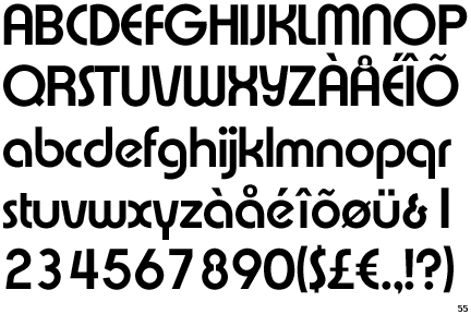
The upper-case 'Q' tail touches the circle.
|
 |
The '&' (ampersand) looks like 'Et' with a gap at the top.
|
 |
The '4' is open.
|
 |
The upper-case 'Y' right-hand arm forms a continuous stroke with the tail.
|
 |
The leg of the upper-case 'R' is curved outwards.
|
 |
The upper-case 'E' is drawn as a 'C' with a bar.
|
 |
The lower-case 'e' has a straight angled bar.
|
Note that the fonts in the icons shown above represent general examples, not necessarily the two fonts chosen for comparison.
Show Examples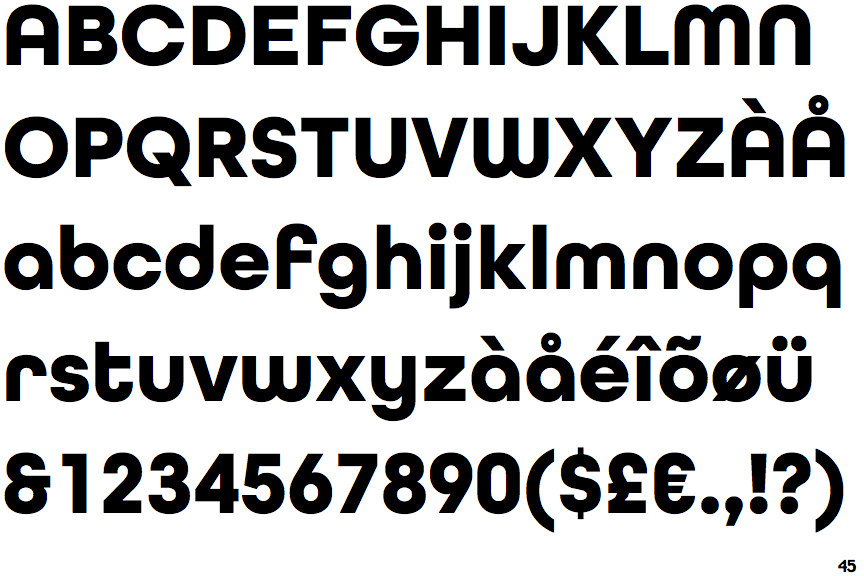
 |
The upper-case 'Q' tail crosses the circle.
|
 |
The '&' (ampersand) looks like 'Et' with one enclosed loop (with or without exit stroke).
|
 |
The '4' is closed.
|
 |
The upper-case 'Y' arms and tail are separate strokes.
|
 |
The leg of the upper-case 'R' is straight.
|
 |
The upper-case 'E' is normal letter shape.
|
 |
The lower-case 'e' has a straight horizontal bar.
|