 |
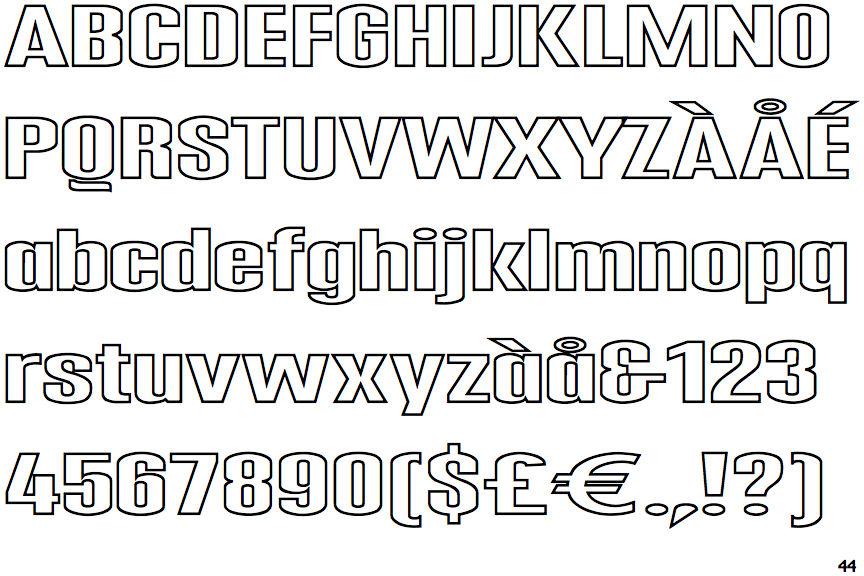
The upper-case 'Q' tail is below and separated from the circle.
|
 |
The '4' is open.
|
 |
The lower-case 'g' is single-storey (with or without loop).
|
 |
The lower-case 'a' stem stops at the top of the bowl (single storey).
|
 |
The leg of the upper-case 'R' is curved outwards.
|
 |
The centre strokes of the upper-case 'W' meet at a vertex.
|
Note that the fonts in the icons shown above represent general examples, not necessarily the two fonts chosen for comparison.
Show Examples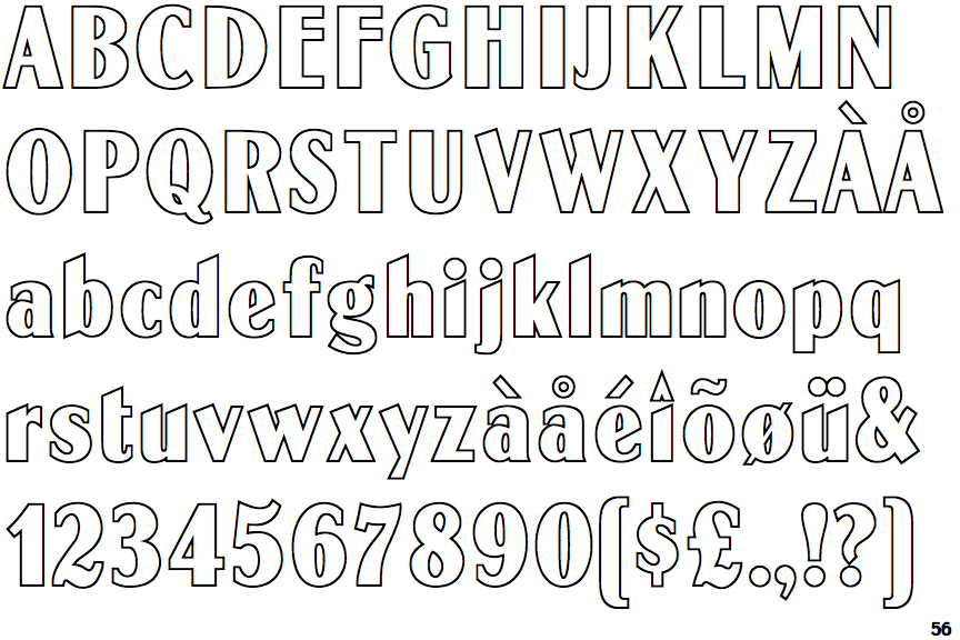
 |
The upper-case 'Q' tail crosses the circle.
|
 |
The '4' is closed.
|
 |
The lower-case 'g' is double-storey (with or without gap).
|
 |
The lower-case 'a' stem curves over the top of the bowl (double storey).
|
 |
The leg of the upper-case 'R' is straight.
|
 |
The centre strokes of the upper-case 'W' meet in a T on the left.
|