 |
The '4' is closed.
|
 |
The foot of the '4' has double-sided serifs.
|
 |
The lower storey of the lower-case 'g' has no gap.
|
 |
The top vertices of the upper-case 'M' have symmetrical single-sided serifs.
|
 |
The lower-case 't' has double-sided bar which forms a diagonal with the vertical.
|
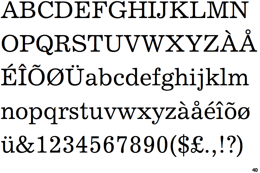
Note that the fonts in the icons shown above represent general examples, not necessarily the two fonts chosen for comparison.
Show Examples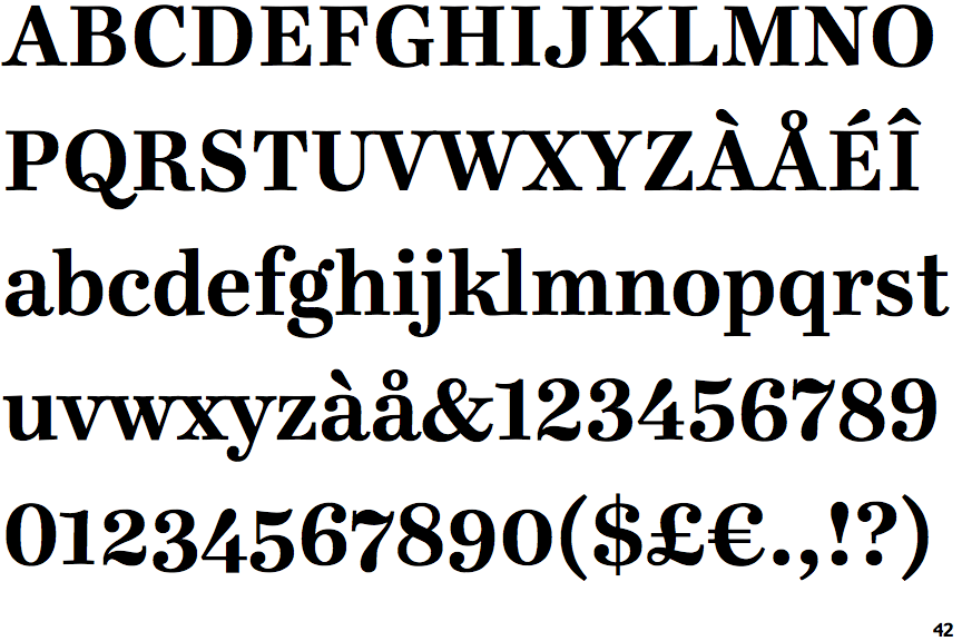
 |
The '4' is open.
|
 |
The foot of the '4' has no serifs.
|
 |
The lower storey of the lower-case 'g' has a gap.
|
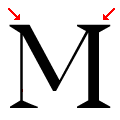 |
The top vertices of the upper-case 'M' have one serif on the left, two on the right.
|
 |
The lower-case 't' has double-sided bar which forms a right-angle with the vertical.
|