
 |
The upper-case 'J' sits on the baseline.
|
 |
The centre bar of the upper-case 'P' meets the vertical.
|
 |
The upper-case 'U' has a stem/serif.
|
 |
The upper-case 'Y' right-hand arm forms a continuous stroke with the tail.
|
 |
The upper-case 'G' foot has no spur or serif.
|
 |
The centre bar of the upper-case 'E' has serifs.
|
 |
The centre bar of the upper-case 'R' meets the vertical.
|
 |
The top of the upper-case 'W' has four upper terminals.
|
 |
The bar of the upper-case 'G' is double-sided.
|
 |
The centre bar of the upper-case 'F' has serifs.
|
There are more than ten differences; only the first ten are shown.
Note that the fonts in the icons shown above represent general examples, not necessarily the two fonts chosen for comparison.
Show Examples
 |
The upper-case 'J' descends below the baseline.
|
 |
The centre bar of the upper-case 'P' leaves a gap with the vertical.
|
 |
The upper-case 'U' has no stem/serif.
|
 |
The upper-case 'Y' arms and tail are separate strokes.
|
 |
The upper-case 'G' foot has a downward pointing spur.
|
 |
The centre bar of the upper-case 'E' has no serifs.
|
 |
The centre bar of the upper-case 'R' leaves a gap with the vertical.
|
 |
The top of the upper-case 'W' has three upper terminals.
|
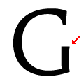 |
The bar of the upper-case 'G' is no bar.
|
 |
The centre bar of the upper-case 'F' has no serifs.
|