Identifont

Fonts by Appearance

Fonts by Name

Fonts by Similarity

Fonts by Picture

Fonts by Designer/Publisher

Differences

TweetTweet Differences

Compare: and  

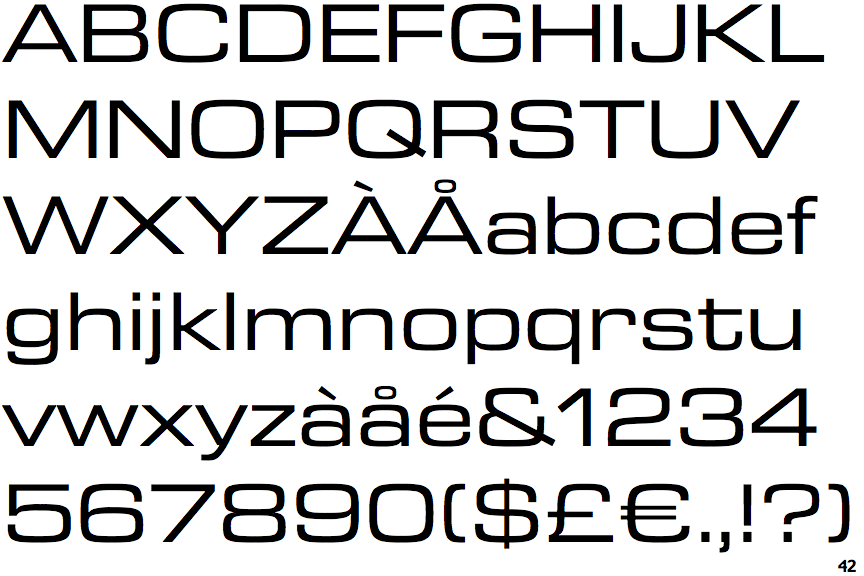
Eurostile Next Extended

Eurostile Next Extended

Open
The '&' (ampersand) is traditional style with a gap at the top.
Bar
The diagonal strokes of the upper-case 'K' connect to the vertical via a horizontal bar.
Outwards
The leg of the upper-case 'R' is curved outwards.
Curved
The right side of the upper-case 'G' is curved.

Note that the fonts in the icons shown above represent general examples, not necessarily the two fonts chosen for comparison.

Show Examples
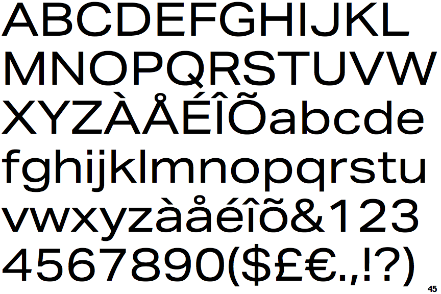
Aktiv Grotesk Extended

Aktiv Grotesk Extended

Closed
The '&' (ampersand) is traditional style with two enclosed loops.
Double
The diagonal strokes of the upper-case 'K' meet in a 'T'.
Straight
The leg of the upper-case 'R' is straight.
Flat
The right side of the upper-case 'G' has a flat section.