 |
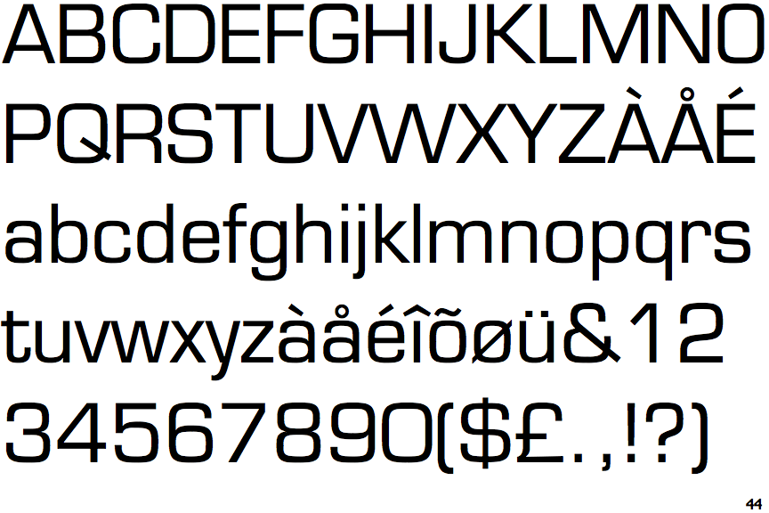
The top storey of the '3' is a smooth curve.
|
 |
The top of the lower-case 'q' has a vertical or slightly angled spur (pointed or flat).
|
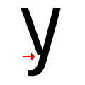 |
There is a break at the junction of the lower-case 'y'.
|
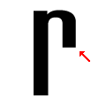 |
The arm of the lower-case 'r' points downwards.
|
Note that the fonts in the icons shown above represent general examples, not necessarily the two fonts chosen for comparison.
Show Examples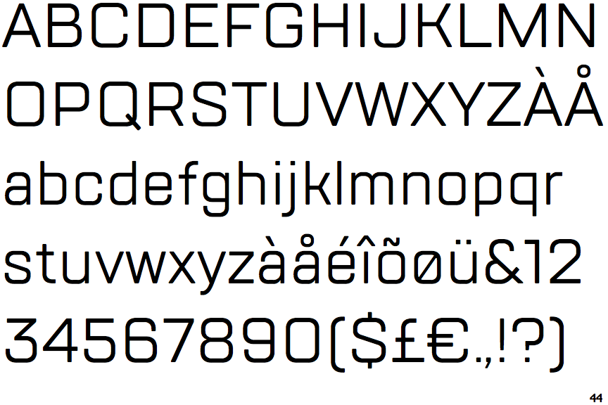
 |
The top storey of the '3' is a sharp angle.
|
 |
The top of the lower-case 'q' has no spur or serif.
|
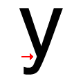 |
There is a smooth join at the junction of the lower-case 'y'.
|
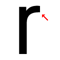 |
The arm of the lower-case 'r' points upwards or slightly downwards.
|