 |
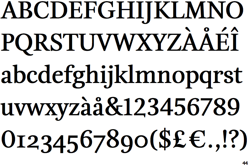
The upper-case 'Q' tail touches the circle.
|
 |
The verticals of the upper-case 'M' are sloping.
|
 |
The lower-case 'g' is double-storey (with or without gap).
|
 |
The lower-case 'a' stem curves over the top of the bowl (double storey).
|
 |
The top of the lower-case 'q' has a vertical or slightly angled spur (pointed or flat).
|
 |
The foot of the '4' has no serifs.
|
 |
The sides of the lower-case 'y' are angled (V-shaped).
|
 |
The top vertices of the upper-case 'M' have symmetrical single-sided serifs.
|
Note that the fonts in the icons shown above represent general examples, not necessarily the two fonts chosen for comparison.
Show Examples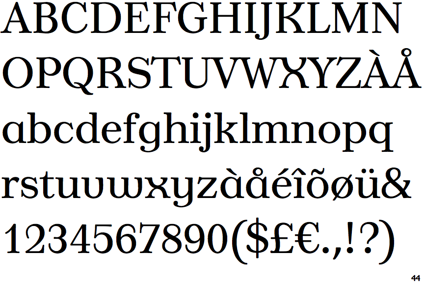
 |
The upper-case 'Q' tail crosses the circle.
|
 |
The verticals of the upper-case 'M' are parallel.
|
 |
The lower-case 'g' is single-storey (with or without loop).
|
 |
The lower-case 'a' stem stops at the top of the bowl (single storey).
|
 |
The top of the lower-case 'q' has a right-facing serif.
|
 |
The foot of the '4' has double-sided serifs.
|
 |
The sides of the lower-case 'y' are parallel (U-shaped).
|
 |
The top vertices of the upper-case 'M' have symmetrical double-sided serifs.
|