 |
The upper-case 'Q' tail touches the circle.
|
 |
The upper-case 'J' descends below the baseline.
|
 |
The diagonal strokes of the upper-case 'K' meet at the vertical (with or without a gap).
|
 |
The verticals of the upper-case 'M' are sloping.
|
 |
The top of the upper-case 'A' has no serifs or cusps.
|
 |
The upper-case 'G' foot has no spur or serif.
|
 |
The foot of the '4' has no serifs.
|
 |
The centre vertex of the upper-case 'W' has no serifs.
|
 |
The top vertices of the upper-case 'M' have symmetrical single-sided serifs.
|
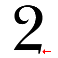 |
The base of the '2' has a downward-pointing serif.
|
Note that the fonts in the icons shown above represent general examples, not necessarily the two fonts chosen for comparison.
Show Examples
 |
The upper-case 'Q' tail crosses the circle.
|
 |
The upper-case 'J' sits on the baseline.
|
 |
The diagonal strokes of the upper-case 'K' meet in a 'T'.
|
 |
The verticals of the upper-case 'M' are parallel.
|
 |
The top of the upper-case 'A' has serifs both sides, or a top bar.
|
 |
The upper-case 'G' foot has a downward pointing spur.
|
 |
The foot of the '4' has double-sided serifs.
|
 |
The centre vertex of the upper-case 'W' has two separate serifs.
|
 |
The top vertices of the upper-case 'M' have symmetrical double-sided serifs.
|
 |
The base of the '2' has an upward-pointing serif.
|