 |
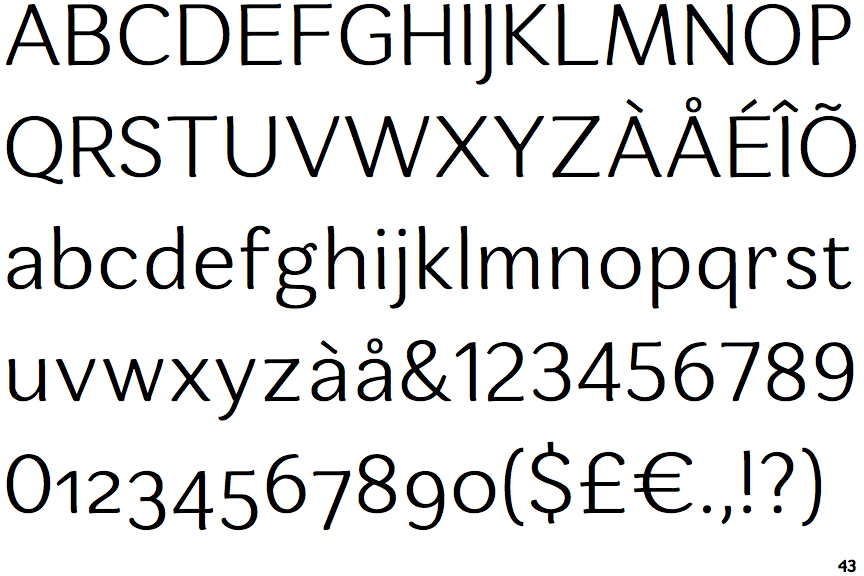
The '&' (ampersand) is traditional style with two enclosed loops.
|
 |
The top storey of the '3' is a smooth curve.
|
 |
The 'l' (lower-case 'L') has no serifs or tail.
|
 |
The lower-case 'e' has a straight horizontal bar.
|
 |
The lower storey of the lower-case 'g' has no gap.
|
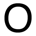 |
The upper-case letter 'O' is taller than it is wide.
|
Note that the fonts in the icons shown above represent general examples, not necessarily the two fonts chosen for comparison.
Show Examples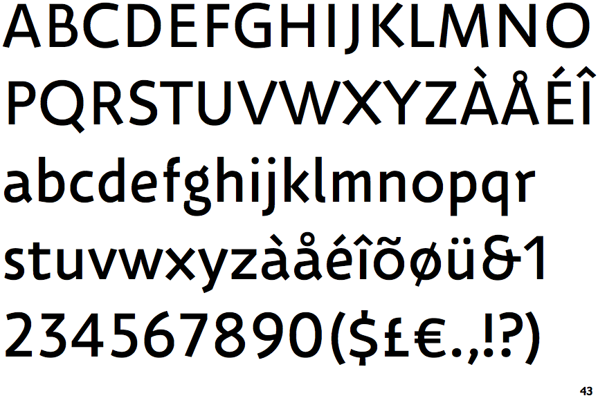
 |
The '&' (ampersand) looks like 'Et' with one enclosed loop (with or without exit stroke).
|
 |
The top storey of the '3' is a sharp angle.
|
 |
The 'l' (lower-case 'L') has a right-facing lower serif or tail.
|
 |
The lower-case 'e' has a straight angled bar.
|
 |
The lower storey of the lower-case 'g' has a gap.
|
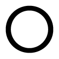 |
The upper-case letter 'O' is circular or equal proportions.
|