 |
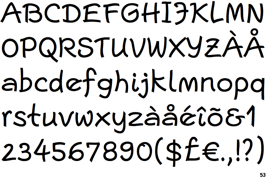
The '$' (dollar) has a single line crossing the 'S'.
|
 |
The '&' (ampersand) looks like 'Et' with a gap at the top.
|
 |
The '4' is open.
|
 |
The centre bar of the upper-case 'P' meets the vertical.
|
 |
The lower-case 'g' is single-storey (with or without loop).
|
 |
The upper-case 'G' has a bar to the left.
|
 |
The upper-case 'J' has a bar to the left.
|
 |
The centre bar of the upper-case 'R' leaves a gap with the vertical.
|
 |
The strokes are upright.
|
 |
The tail of the lower-case 'y' curves or points to the left without a loop.
|
Note that the fonts in the icons shown above represent general examples, not necessarily the two fonts chosen for comparison.
Show Examples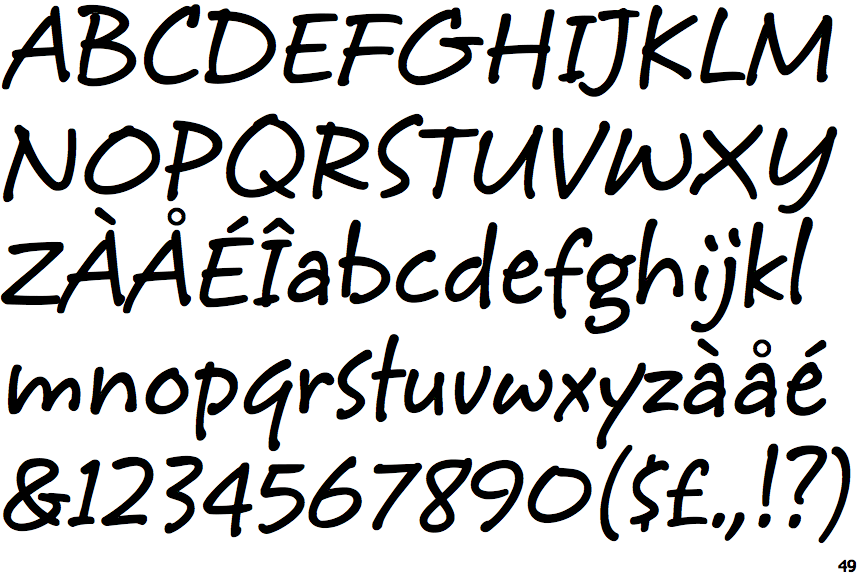
 |
The '$' (dollar) has a single line which does not cross the 'S'.
|
 |
The '&' (ampersand) is traditional style with two enclosed loops.
|
 |
The '4' is closed.
|
 |
The centre bar of the upper-case 'P' crosses the vertical.
|
 |
The lower-case 'g' is double-storey (with or without gap).
|
 |
The upper-case 'G' has double-sided bar.
|
 |
The upper-case 'J' has a bar both sides.
|
 |
The centre bar of the upper-case 'R' meets the vertical.
|
 |
The strokes are sloped right (italic, oblique, or cursive).
|
 |
The tail of the lower-case 'y' is substantially straight.
|