 |
The upper-case 'U' has no stem/serif.
|
 |
The top stroke of the upper-case 'C' has a vertical or angled upward-pointing serif.
|
 |
The upper-case 'G' foot has no spur or serif.
|
 |
The top of the lower-case 'q' has no spur or serif.
|
 |
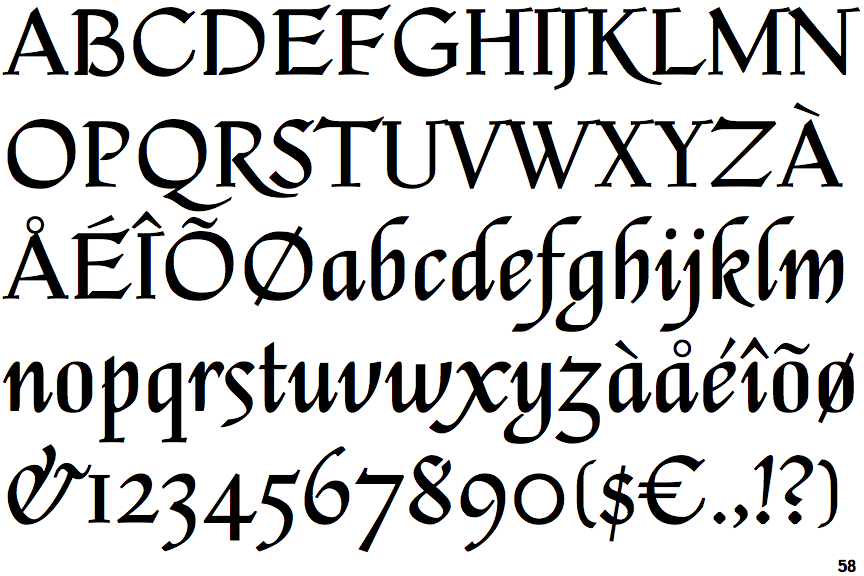
The strokes are upright.
|
 |
The sides of the lower-case 'y' are parallel (U-shaped).
|
 |
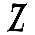
The centre vertex of the upper-case 'W' has two separate serifs.
|
 |
The dot on the lower-case 'i' or 'j' is circular or oval.
|
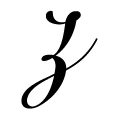 |
The lower-case 'z' is double-storey.
|
Note that the fonts in the icons shown above represent general examples, not necessarily the two fonts chosen for comparison.
Show Examples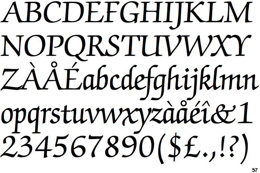
 |
The upper-case 'U' has a stem/serif.
|
 |
The top stroke of the upper-case 'C' has no upward-pointing serif.
|
 |
The upper-case 'G' foot has a downward pointing spur.
|
 |
The top of the lower-case 'q' has a vertical or slightly angled spur (pointed or flat).
|
 |
The strokes are sloped right (italic, oblique, or cursive).
|
 |
The sides of the lower-case 'y' are angled (V-shaped).
|
 |
The centre vertex of the upper-case 'W' has no serifs.
|
 |
The dot on the lower-case 'i' or 'j' is diamond-shaped.
|
 |
The lower-case 'z' is single-storey without a bar.
|