Fonts by Appearance
Fonts by Name
Fonts by Similarity
Fonts by Picture
Fonts by Designer/Publisher
Tweet Differences
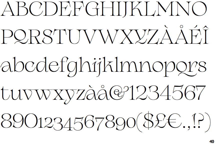
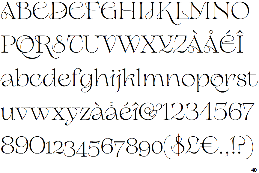
Compare: and
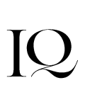
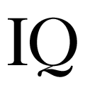
Note that the fonts in the icons shown above represent general examples, not necessarily the two fonts chosen for comparison.