


 |
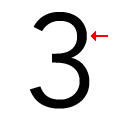
The top storey of the '3' is a smooth curve.
|
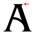 |
The top of the upper-case 'A' has serifs both sides, or a top bar.
|
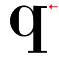 |
The top of the lower-case 'q' has a right-facing serif.
|
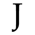 |
The tail of the upper-case 'J' has a flat end or cusp.
|
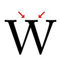 |
The centre vertex of the upper-case 'W' has two separate serifs.
|
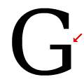 |
The bar of the upper-case 'G' is single-sided, left-facing.
|
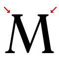 |
The top vertices of the upper-case 'M' have symmetrical double-sided serifs.
|
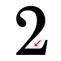 |
The base of the '2' is straight.
|
Note that the fonts in the icons shown above represent general examples, not necessarily the two fonts chosen for comparison.
Show Examples
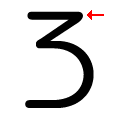 |
The top storey of the '3' is a sharp angle.
|
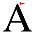 |
The top of the upper-case 'A' has no serifs or cusps.
|
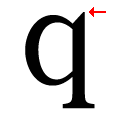 |
The top of the lower-case 'q' has a vertical or slightly angled spur (pointed or flat).
|
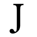 |
The tail of the upper-case 'J' has a rounded end or ball.
|
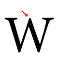 |
The centre vertex of the upper-case 'W' has no serifs.
|
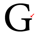 |
The bar of the upper-case 'G' is double-sided.
|
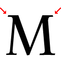 |
The top vertices of the upper-case 'M' have symmetrical single-sided serifs.
|
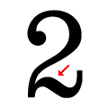 |
The base of the '2' is curved.
|