 |
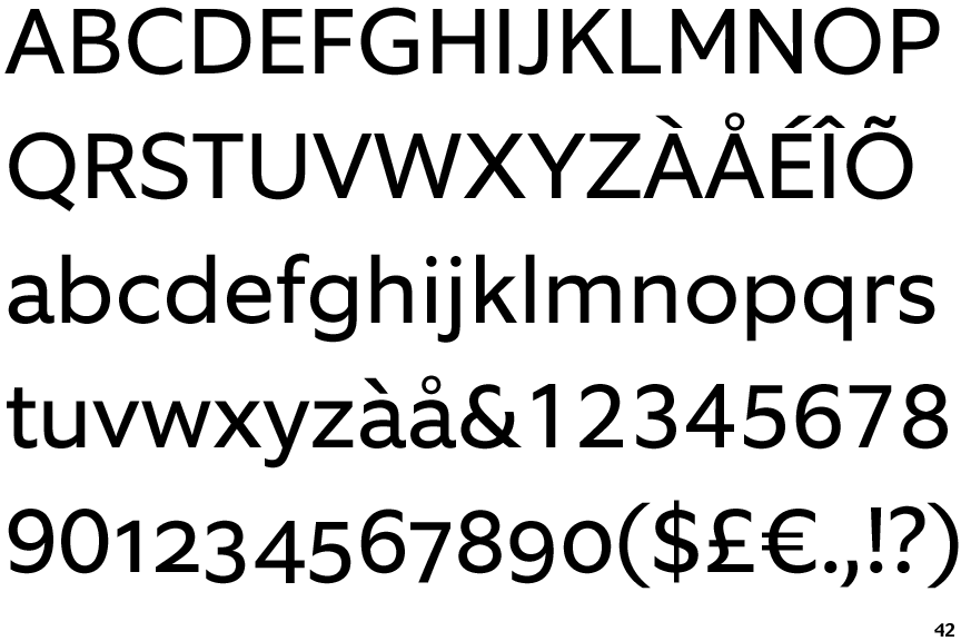
The upper-case 'Q' tail touches the circle.
|
 |
The '&' (ampersand) is traditional style with a gap at the top.
|
 |
The centre vertex of the upper-case 'M' is above the baseline.
|
 |
The leg of the upper-case 'R' is straight.
|
 |
The right side of the upper-case 'G' has a flat section.
|
 |
The tail of the lower-case 'y' is curved or U-shaped to the left.
|
Note that the fonts in the icons shown above represent general examples, not necessarily the two fonts chosen for comparison.
Show Examples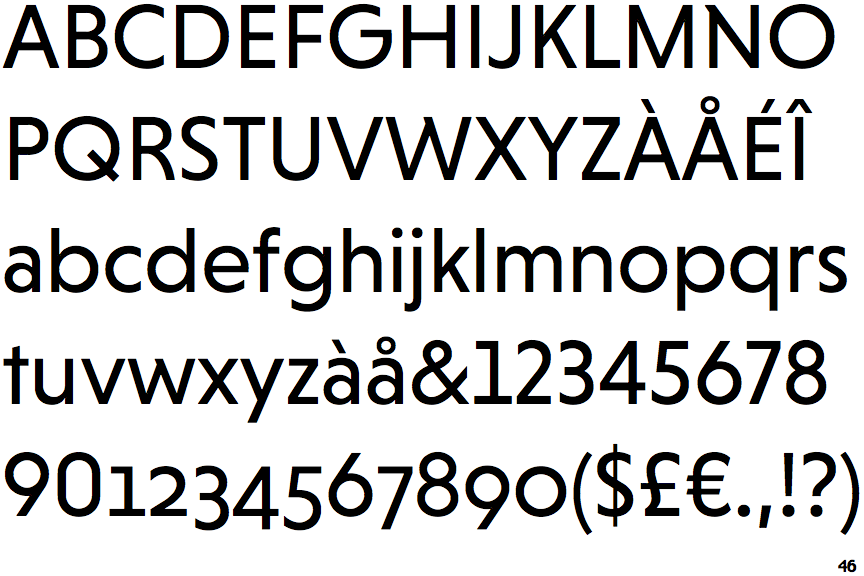
 |
The upper-case 'Q' tail crosses the circle.
|
 |
The '&' (ampersand) is traditional style with two enclosed loops.
|
 |
The centre vertex of the upper-case 'M' is on the baseline.
|
 |
The leg of the upper-case 'R' is curved outwards.
|
 |
The right side of the upper-case 'G' is curved.
|
 |
The tail of the lower-case 'y' is substantially straight.
|