 |
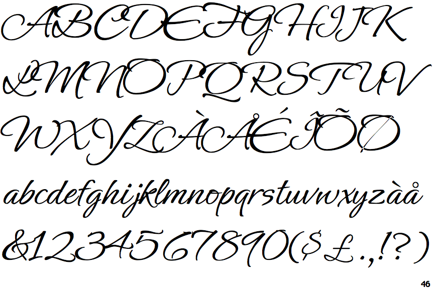
The upper-case 'Q' tail is below and separated from the circle.
|
 |
The '$' (dollar) has a single line which does not cross the 'S'.
|
 |
The '&' (ampersand) is traditional style with two enclosed loops.
|
 |
The '4' is closed.
|
 |
The centre bar of the upper-case 'P' crosses the vertical.
|
 |
The upper-case 'J' has a bar both sides.
|
 |
The upper-case 'E' is drawn as a 'C' with a bar.
|
 |
The centre bar of the upper-case 'R' crosses the vertical.
|
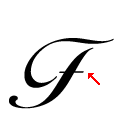 |
The bar of the upper-case 'F' is plain.
|
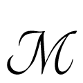 |
The top vertices of the upper-case 'M' have no loops.
|
There are more than ten differences; only the first ten are shown.
Note that the fonts in the icons shown above represent general examples, not necessarily the two fonts chosen for comparison.
Show Examples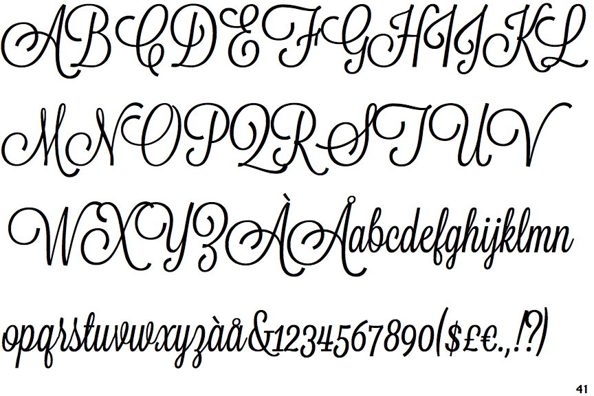
 |
The upper-case 'Q' tail forms part of the stroke of an open circle.
|
 |
The '$' (dollar) has a single line crossing the 'S'.
|
 |
The '&' (ampersand) is traditional style with a gap at the top.
|
 |
The '4' is open.
|
 |
The centre bar of the upper-case 'P' meets the vertical.
|
 |
The upper-case 'J' has a bar to the left.
|
 |
The upper-case 'E' is drawn as a single stroke (with or without loop).
|
 |
The centre bar of the upper-case 'R' meets the vertical.
|
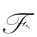 |
The bar of the upper-case 'F' is terminated with a flourish or serif on the right.
|
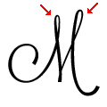 |
The top vertices of the upper-case 'M' have loops on both.
|