Differences
Engschrift Austria
 |
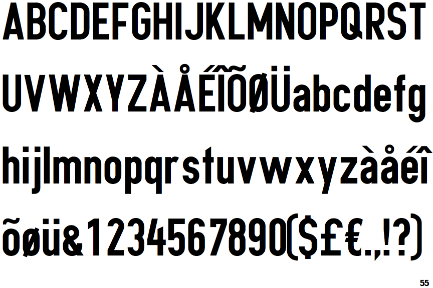
The upper-case 'Q' tail crosses the circle.
|
 |
The '&' (ampersand) is traditional style with two enclosed loops.
|
 |
The upper-case 'J' sits on the baseline.
|
 |
The lower-case 'g' is single-storey (with or without loop).
|
 |
The 'l' (lower-case 'L') has no serifs or tail.
|
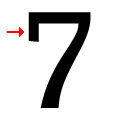 |
The top of the '7' has a downward-pointing serif or bar.
|
 |
The tail of the lower-case 't' is straight.
|
Note that the fonts in the icons shown above represent general examples, not necessarily the two fonts chosen for comparison.
Show ExamplesXXII Neue Norm Rounded Condensed Black
 |
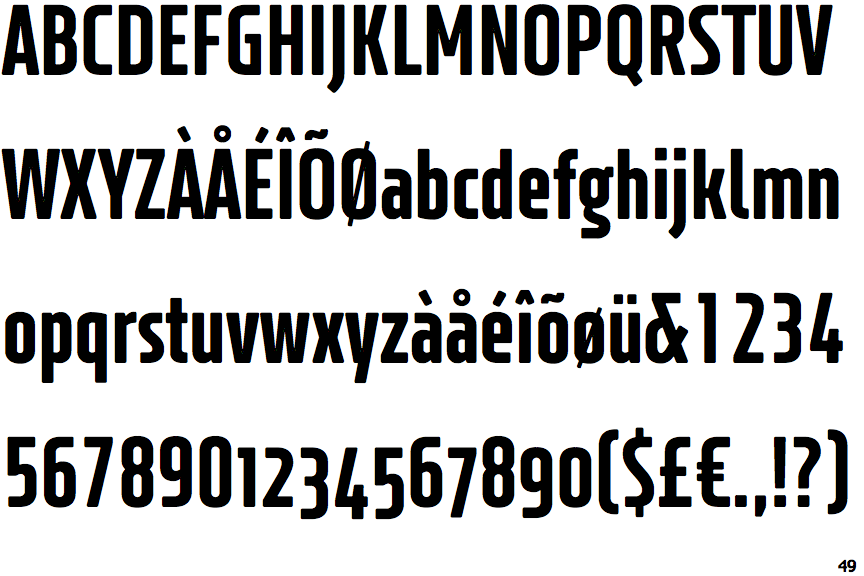
The upper-case 'Q' tail touches the circle.
|
 |
The '&' (ampersand) is traditional style with a gap at the top.
|
 |
The upper-case 'J' descends below the baseline.
|
 |
The lower-case 'g' is double-storey (with or without gap).
|
 |
The 'l' (lower-case 'L') has a right-facing lower serif or tail.
|
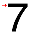 |
The top of the '7' has no serif or bar.
|
 |
The tail of the lower-case 't' is curved.
|
