 |
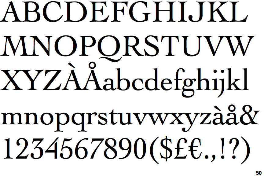
The upper-case 'Q' tail is below and separated from the circle.
|
 |
The '4' is open.
|
 |
The centre vertex of the upper-case 'M' is on the baseline.
|
 |
The top stroke of the upper-case 'C' has no upward-pointing serif.
|
 |
The foot of the '4' has no serifs.
|
 |
The centre vertex of the upper-case 'W' has two separate serifs.
|
 |
The feet of the lower-case 'h' have two serifs on each foot.
|
 |
The lower storey of the lower-case 'g' has no gap.
|
 |
The top vertices of the upper-case 'M' have symmetrical double-sided serifs.
|
 |
The feet of the lower-case 'm' have two serifs on each foot.
|
There are more than ten differences; only the first ten are shown.
Note that the fonts in the icons shown above represent general examples, not necessarily the two fonts chosen for comparison.
Show Examples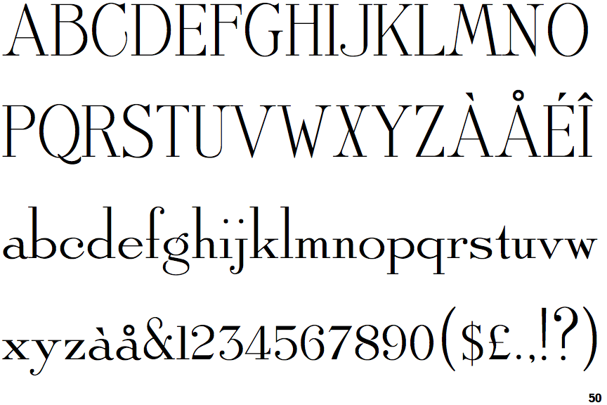
 |
The upper-case 'Q' tail crosses the circle.
|
 |
The '4' is closed.
|
 |
The centre vertex of the upper-case 'M' is above the baseline.
|
 |
The top stroke of the upper-case 'C' has a vertical or angled upward-pointing serif.
|
 |
The foot of the '4' has double-sided serifs.
|
 |
The centre vertex of the upper-case 'W' has no serifs.
|
 |
The feet of the lower-case 'h' have two serifs on the left and one on the right.
|
 |
The lower storey of the lower-case 'g' has a gap.
|
 |
The top vertices of the upper-case 'M' have symmetrical single-sided serifs.
|
 |
The feet of the lower-case 'm' have two serifs on the left, and one on the centre and right.
|