

 |
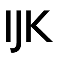
The upper-case 'J' descends below the baseline.
|
 |
The characters have serifs.
|
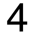 |
The '4' is closed.
|
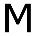 |
The centre vertex of the upper-case 'M' is above the baseline.
|
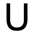 |
The upper-case 'U' has no stem/serif.
|
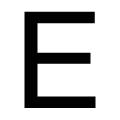 |
The upper-case 'E' is normal letter shape.
|
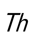 |
The strokes are sloped right (italic, oblique, or cursive).
|
Note that the fonts in the icons shown above represent general examples, not necessarily the two fonts chosen for comparison.
Show Examples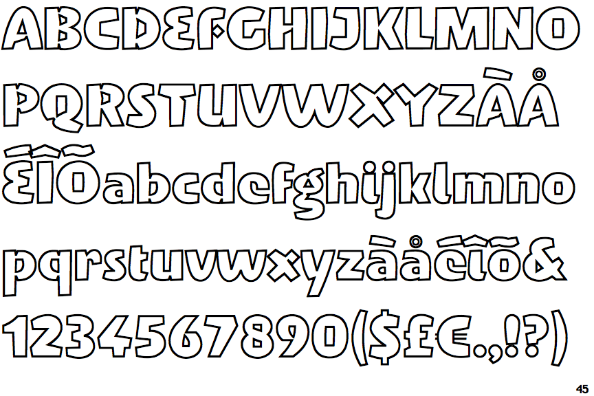
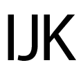 |
The upper-case 'J' sits on the baseline.
|
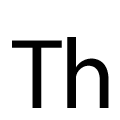 |
The characters do not have serifs.
|
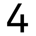 |
The '4' is open.
|
 |
The centre vertex of the upper-case 'M' is on the baseline.
|
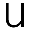 |
The upper-case 'U' has a stem/serif.
|
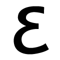 |
The upper-case 'E' is drawn as a single stroke (with or without loop).
|
 |
The strokes are upright.
|