 |
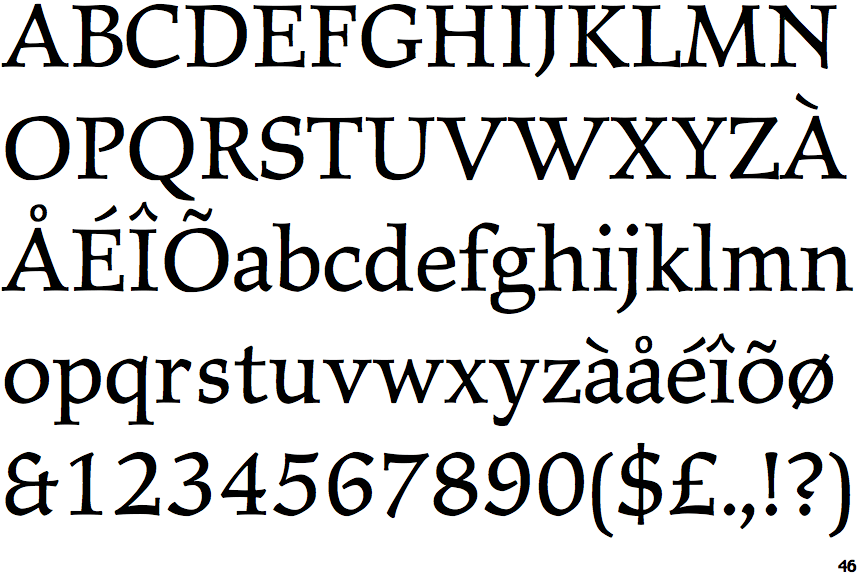
The '&' (ampersand) looks like 'Et' with one enclosed loop (with or without exit stroke).
|
 |
The dot on the '?' (question-mark) is circular or oval.
|
 |
The top stroke of the upper-case 'C' has no upward-pointing serif.
|
 |
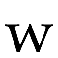
The top of the upper-case 'W' has three upper terminals.
|
 |
The foot of the '4' has double-sided serifs.
|
 |
The tail of the upper-case 'J' has a tapered end.
|
 |
The feet of the lower-case 'h' have two serifs on the left and one on the right.
|
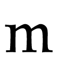 |
The feet of the lower-case 'm' have one serif on the left, two on the centre, and one on the right.
|
 |
The centre vertex of the lower-case 'w' has no centre serifs.
|
 |
The top stroke of the upper-case 'S' has no upward-pointing serif.
|
There are more than ten differences; only the first ten are shown.
Note that the fonts in the icons shown above represent general examples, not necessarily the two fonts chosen for comparison.
Show Examples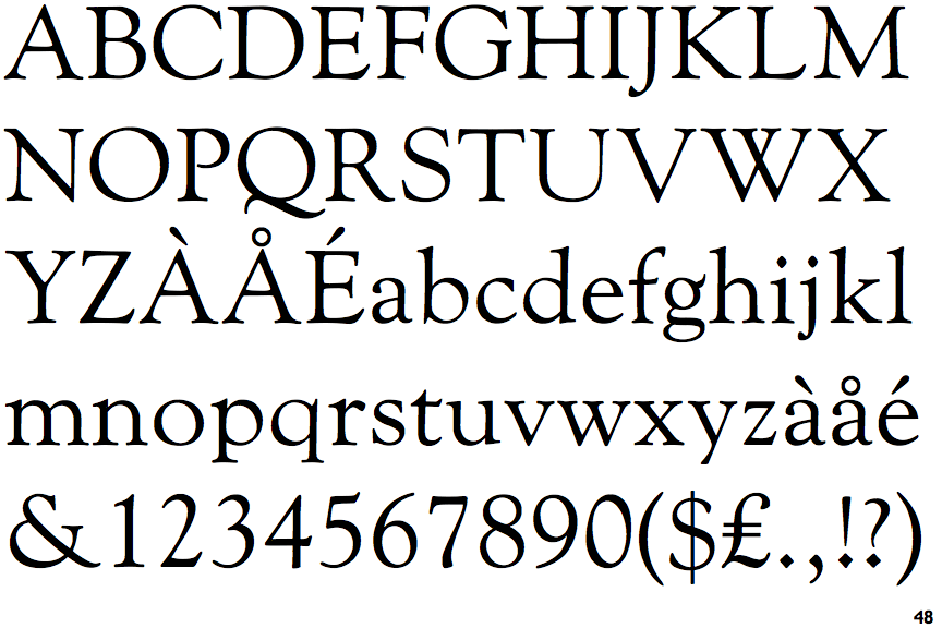
 |
The '&' (ampersand) is traditional style with a gap at the top.
|
 |
The dot on the '?' (question-mark) is diamond-shaped or triangular.
|
 |
The top stroke of the upper-case 'C' has a vertical or angled upward-pointing serif.
|
 |
The top of the upper-case 'W' has four upper terminals.
|
 |
The foot of the '4' has no serifs.
|
 |
The tail of the upper-case 'J' has a flat end or cusp.
|
 |
The feet of the lower-case 'h' have two serifs on each foot.
|
 |
The feet of the lower-case 'm' have two serifs on each foot.
|
 |
The centre vertex of the lower-case 'w' has distinct centre serifs.
|
 |
The top stroke of the upper-case 'S' has a vertical or angled upward-pointing serif.
|