 |
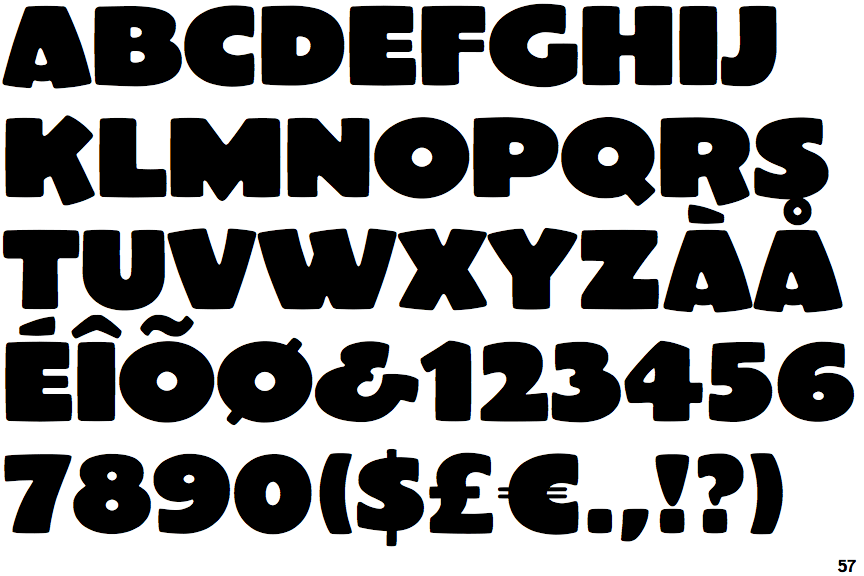
The upper-case 'Q' tail touches the circle.
|
 |
The '&' (ampersand) looks like 'Et' with a gap at the top.
|
 |
The diagonal strokes of the upper-case 'K' meet in a 'T'.
|
 |
The upper-case 'G' has no bar.
|
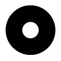 |
The upper-case letter 'O' has a centred hole, with a diameter similar to or smaller than the stroke thickness.
|
Note that the fonts in the icons shown above represent general examples, not necessarily the two fonts chosen for comparison.
Show Examples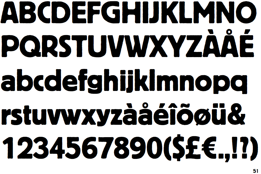
 |
The upper-case 'Q' tail crosses the circle.
|
 |
The '&' (ampersand) is traditional style with two enclosed loops.
|
 |
The diagonal strokes of the upper-case 'K' meet at the vertical (with or without a gap).
|
 |
The upper-case 'G' has a bar to the left.
|
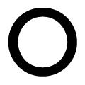 |
The upper-case letter 'O' has a centred hole, with a diameter larger than the stroke thickness.
|