 |
The '&' (ampersand) looks like 'Et' with one enclosed loop (with or without exit stroke).
|
 |
The diagonal strokes of the upper-case 'K' connect to the vertical via a horizontal bar.
|
 |
The top storey of the '3' is a sharp angle.
|
 |
The upper-case 'G' has a spur/tail.
|
 |
The upper-case 'G' has no bar.
|
 |
The upper-case 'Y' arms and tail are separate strokes.
|
 |
The 'l' (lower-case 'L') has a right-facing lower serif or tail.
|
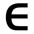 |
The lower-case 'e' is drawn as a 'c' with a bar.
|
 |
The bar of the '4' does not cross the vertical.
|
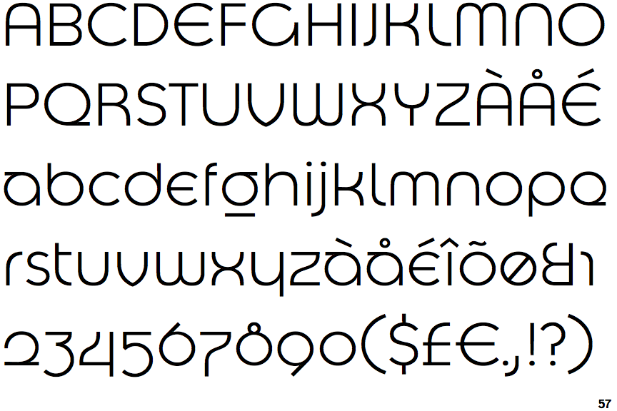
Note that the fonts in the icons shown above represent general examples, not necessarily the two fonts chosen for comparison.
Show Examples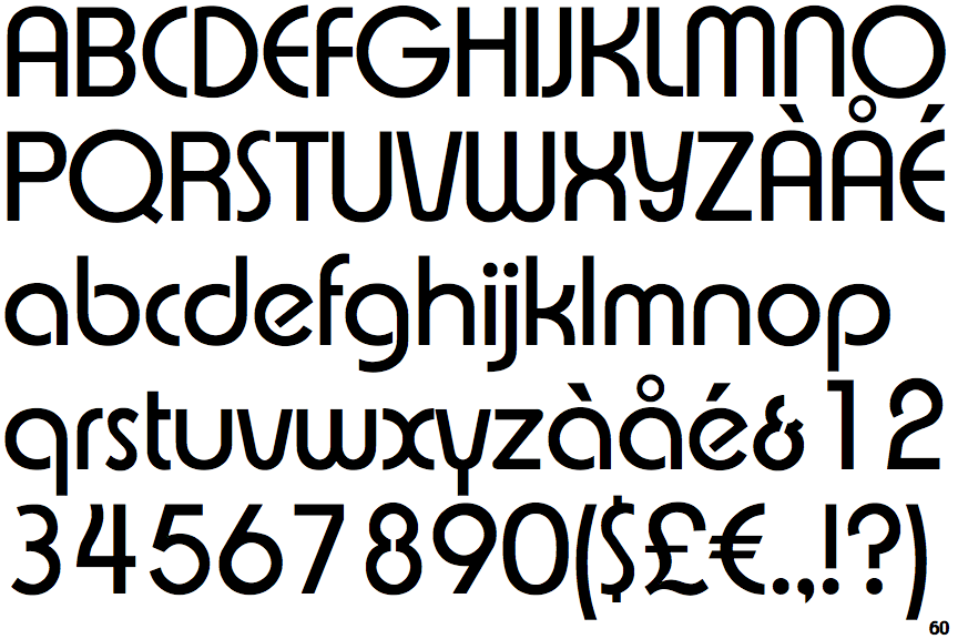
 |
The '&' (ampersand) looks like 'Et' with a gap at the top.
|
 |
The diagonal strokes of the upper-case 'K' meet at the vertical (with or without a gap).
|
 |
The top storey of the '3' is a smooth curve.
|
|
The upper-case 'G' has no spur/tail.
|
 |
The upper-case 'G' has a bar to the left.
|
 |
The upper-case 'Y' right-hand arm forms a continuous stroke with the tail.
|
 |
The 'l' (lower-case 'L') has no serifs or tail.
|
 |
The lower-case 'e' has a straight angled bar.
|
 |
The bar of the '4' crosses the vertical.
|