Differences
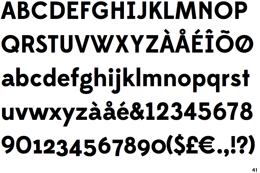
Edmondsans Bold
 |
The upper-case 'Q' tail crosses the circle.
|
 |
The diagonal strokes of the upper-case 'K' meet in a 'T'.
|
 |
The centre vertex of the upper-case 'M' is on the baseline.
|
 |
The dot on the '?' (question-mark) is circular or oval.
|
 |
The verticals of the upper-case 'M' are sloping.
|
 |
The upper-case 'G' has no spur/tail.
|
 |
The dot on the lower-case 'i' or 'j' is circular or oval.
|
 |
The tail of the lower-case 'y' is substantially straight.
|
 |
The upper-case letter 'I' has serifs/bars.
|
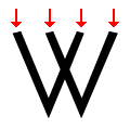 |
The top of the upper-case 'W' has four upper terminals.
|
There are more than ten differences; only the first ten are shown.
Note that the fonts in the icons shown above represent general examples, not necessarily the two fonts chosen for comparison.
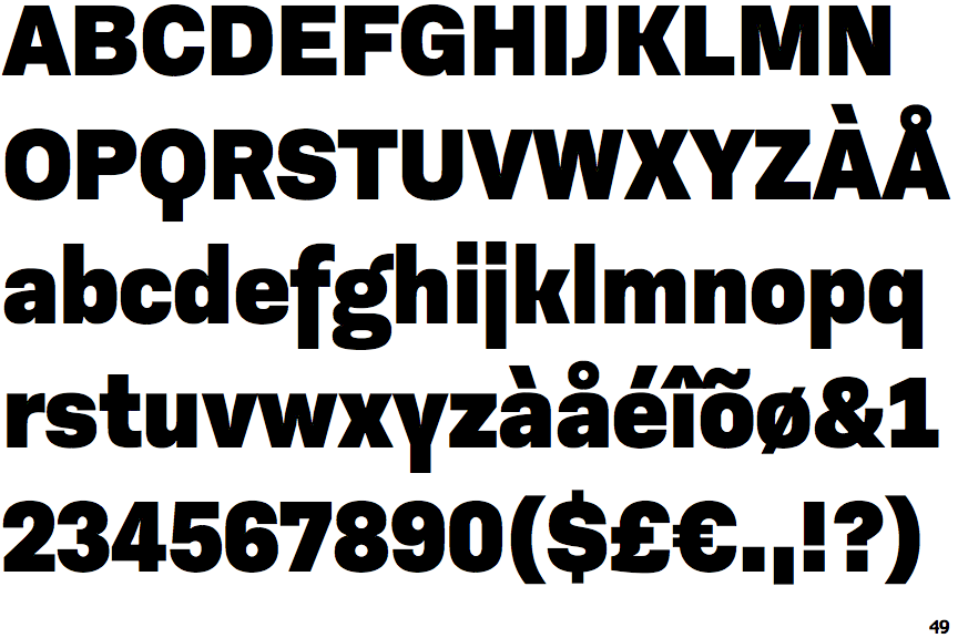
Show ExamplesGodfrey Black
 |
The upper-case 'Q' tail touches the circle.
|
 |
The diagonal strokes of the upper-case 'K' meet at the vertical (with or without a gap).
|
 |
The centre vertex of the upper-case 'M' is above the baseline.
|
 |
The dot on the '?' (question-mark) is square or rectangular.
|
 |
The verticals of the upper-case 'M' are parallel.
|
 |
The upper-case 'G' has a spur/tail.
|
 |
The dot on the lower-case 'i' or 'j' is square or rectangular.
|
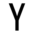 |
The tail of the lower-case 'y' is symmetrical.
|
 |
The upper-case letter 'I' is plain.
|
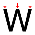 |
The top of the upper-case 'W' has three upper terminals.
|
