 |
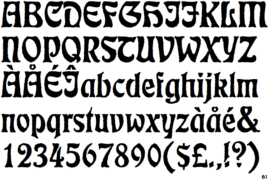
The upper-case 'Q' tail crosses the circle.
|
 |
The '&' (ampersand) is traditional style with two enclosed loops.
|
 |
The upper-case 'U' has a stem/serif.
|
 |
The character outlines are corroded, roughened, or dirty.
|
 |
The centre strokes of the upper-case 'W' meet at a vertex.
|
Note that the fonts in the icons shown above represent general examples, not necessarily the two fonts chosen for comparison.
Show Examples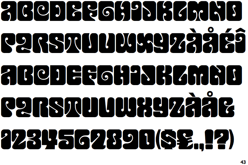
 |
The upper-case 'Q' tail forms part of the stroke of an open circle.
|
 |
The '&' (ampersand) looks like 'Et' with a gap at the top.
|
 |
The upper-case 'U' has no stem/serif.
|
 |
The character outlines are smooth/sharp.
|
 |
The centre strokes of the upper-case 'W' form one centre stroke.
|