 |
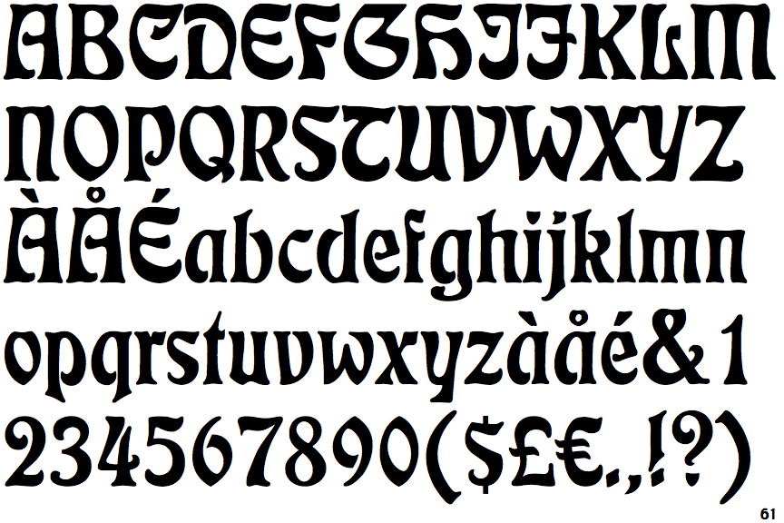
The '&' (ampersand) is traditional style with two enclosed loops.
|
 |
The characters do not have serifs.
|
 |
The centre vertex of the upper-case 'M' is on the baseline.
|
|
The verticals of the upper-case 'M' are parallel.
|
 |
The characters are solid.
|
 |
The upper-case 'Y' right-hand arm forms a continuous stroke with the tail.
|
 |
The upper-case 'E' is drawn as a 'C' with a bar.
|
 |
The tail of the upper-case 'Q' is curved or S-shaped.
|
Note that the fonts in the icons shown above represent general examples, not necessarily the two fonts chosen for comparison.
Show Examples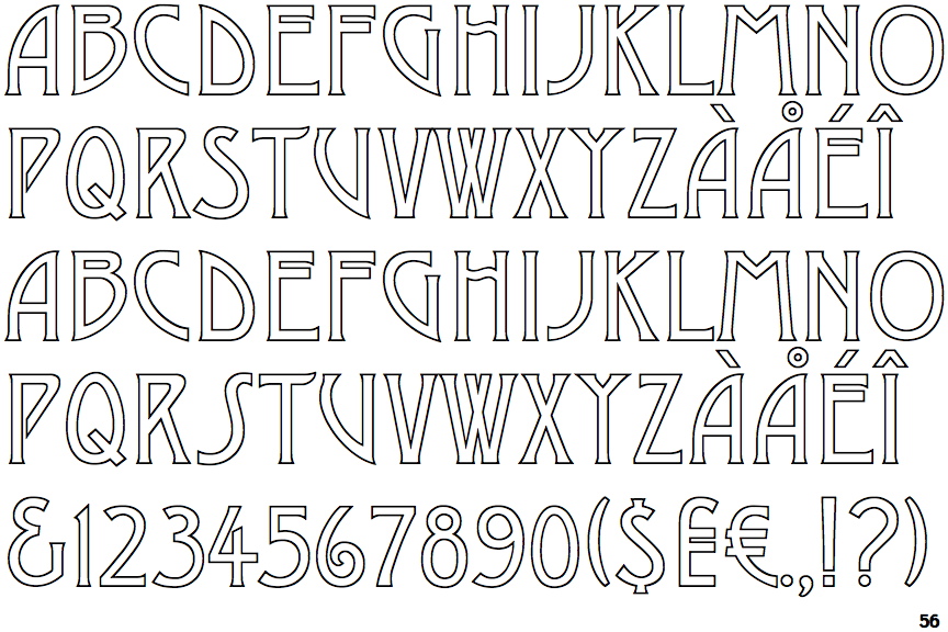
 |
The '&' (ampersand) looks like 'Et' with a gap at the top.
|
 |
The characters have serifs.
|
 |
The centre vertex of the upper-case 'M' is above the baseline.
|
 |
The verticals of the upper-case 'M' are sloping.
|
 |
The characters are outlined, shaded, or filled with a pattern.
|
 |
The upper-case 'Y' arms and tail are separate strokes.
|
 |
The upper-case 'E' is normal letter shape.
|
 |
The tail of the upper-case 'Q' is straight.
|