 |
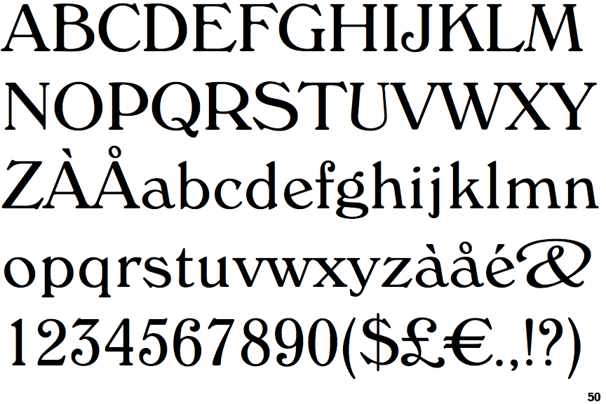
The centre vertex of the upper-case 'M' is on the baseline.
|
 |
The verticals of the upper-case 'M' are sloping.
|
 |
The top storey of the '3' is a sharp angle.
|
 |
The top stroke of the upper-case 'C' has a vertical or angled upward-pointing serif.
|
 |
The upper-case 'G' foot has a forward pointing spur or serif.
|
 |
The bar of the upper-case 'G' is double-sided.
|
 |
The lower-case 'e' has a straight angled bar.
|
 |
The lower storey of the lower-case 'g' has no gap.
|
 |
The stroke of the lower-case 'c' has a flat end or downward-pointing serif.
|
 |
The top vertices of the upper-case 'M' have symmetrical double-sided serifs.
|
There are more than ten differences; only the first ten are shown.
Note that the fonts in the icons shown above represent general examples, not necessarily the two fonts chosen for comparison.
Show Examples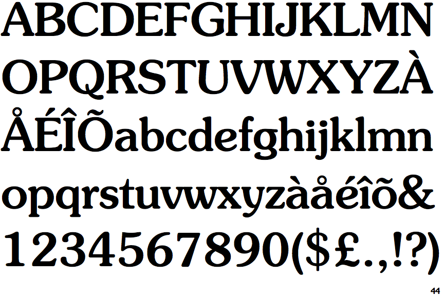
 |
The centre vertex of the upper-case 'M' is above the baseline.
|
|
The verticals of the upper-case 'M' are parallel.
|
 |
The top storey of the '3' is a smooth curve.
|
 |
The top stroke of the upper-case 'C' has no upward-pointing serif.
|
 |
The upper-case 'G' foot has no spur or serif.
|
 |
The bar of the upper-case 'G' is single-sided, left-facing.
|
 |
The lower-case 'e' has a curved bar with no straight segment.
|
 |
The lower storey of the lower-case 'g' has a gap.
|
 |
The stroke of the lower-case 'c' has a rounded end or ball.
|
 |
The top vertices of the upper-case 'M' have symmetrical single-sided serifs.
|