Differences
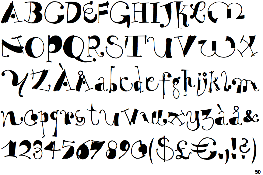
EF Why Not
 |
The upper-case 'Q' tail touches the circle.
|
 |
The '$' (dollar) has a single line crossing the 'S'.
|
 |
The centre bar of the upper-case 'P' meets the vertical.
|
 |
The lower-case 'g' is double-storey (with or without gap).
|
 |
The upper-case 'U' has a stem/serif.
|
 |
The lower-case 'a' stem curves over the top of the bowl (double storey).
|
 |
The upper-case 'G' foot has a downward pointing spur.
|
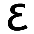 |
The upper-case 'E' is drawn as a single stroke (with or without loop).
|
 |
The bar of the upper-case 'G' is single-sided, left-facing.
|
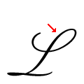 |
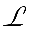
The upper-case 'L' has one upper loop only.
|
There are more than ten differences; only the first ten are shown.
Note that the fonts in the icons shown above represent general examples, not necessarily the two fonts chosen for comparison.
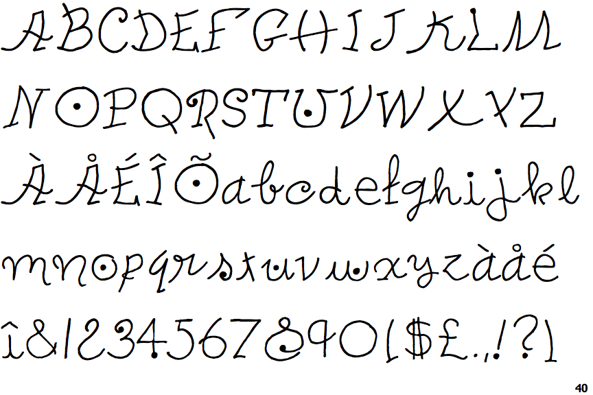
Show ExamplesITC Peter's Miro One
 |
The upper-case 'Q' tail crosses the circle.
|
 |
The '$' (dollar) has a double line crossing the 'S'.
|
 |
The centre bar of the upper-case 'P' crosses the vertical.
|
 |
The lower-case 'g' is single-storey (with or without loop).
|
 |
The upper-case 'U' has no stem/serif.
|
 |
The lower-case 'a' stem stops at the top of the bowl (single storey).
|
 |
The upper-case 'G' foot has no spur or serif.
|
 |
The upper-case 'E' is normal letter shape.
|
 |
The bar of the upper-case 'G' is double-sided.
|
 |
The upper-case 'L' has no loops.
|
