 |
The upper-case 'Q' tail touches the circle.
|
 |
The diagonal strokes of the upper-case 'K' meet at the vertical (with or without a gap).
|
 |
The upper-case 'G' foot has no spur or serif.
|
 |
The foot of the '4' has no serifs.
|
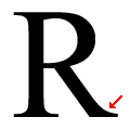 |
The leg of the upper-case 'R' has a single right-pointing serif or foot.
|
 |
The diagonal strokes of the lower-case 'k' meet at the vertical (with or without a gap).
|
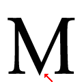 |
The centre vertex of the upper-case 'M' is pointed.
|
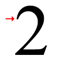 |
The top stroke of the '2' has a point or cusp.
|
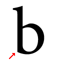 |
The lower-case 'b' has no lower spur, foot, or serif.
|
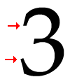 |
The '3' strokes are both plain (pointed or rounded).
|
There are more than ten differences; only the first ten are shown.
Note that the fonts in the icons shown above represent general examples, not necessarily the two fonts chosen for comparison.
Show Examples
 |
The upper-case 'Q' tail crosses the circle.
|
 |
The diagonal strokes of the upper-case 'K' meet in a 'T'.
|
 |
The upper-case 'G' foot has a downward pointing spur.
|
 |
The foot of the '4' has double-sided serifs.
|
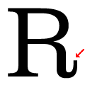 |
The leg of the upper-case 'R' has a vertical or almost vertical spur.
|
 |
The diagonal strokes of the lower-case 'k' meet in a 'T'.
|
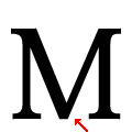 |
The centre vertex of the upper-case 'M' is flat.
|
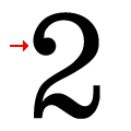 |
The top stroke of the '2' has a ball.
|
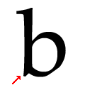 |
The lower-case 'b' has a downward-pointing spur or foot (pointed or flat).
|
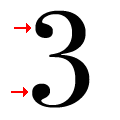 |
The '3' strokes are both terminated with balls.
|