 |
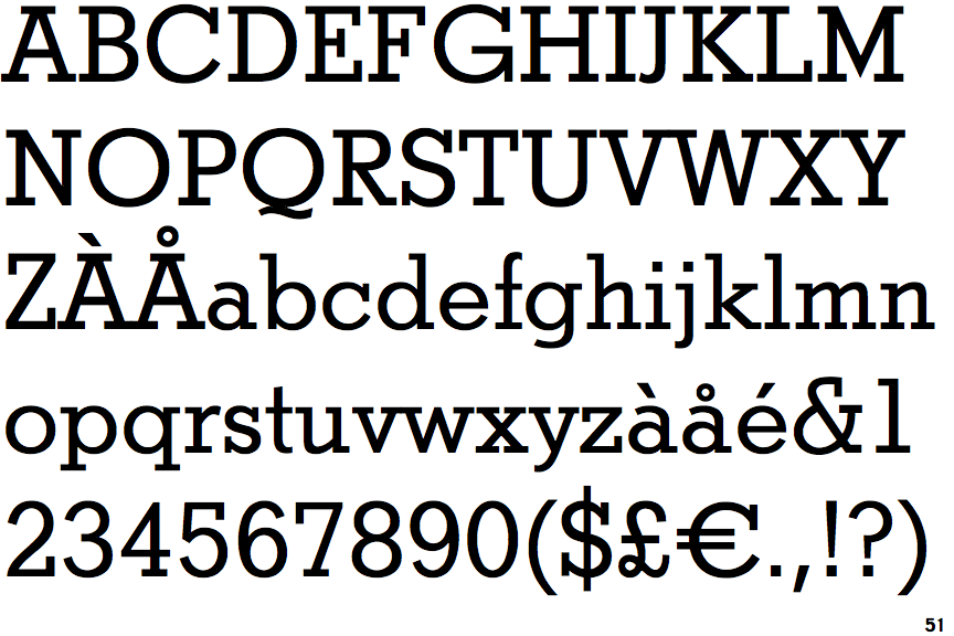
The upper-case 'Q' tail touches the circle.
|
 |
The '&' (ampersand) is traditional style with a gap at the top.
|
 |
The upper-case 'J' sits on the baseline.
|
 |
The dot on the '?' (question-mark) is square or rectangular.
|
 |
The lower-case 'a' stem curves over the top of the bowl (double storey).
|
 |
The centre bar of the upper-case 'E' has serifs.
|
 |
The centre vertex of the upper-case 'W' has no serifs.
|
 |
The bar of the upper-case 'G' is single-sided, left-facing.
|
 |
The centre bar of the upper-case 'F' has serifs.
|
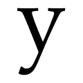 |
The tail of the lower-case 'y' is curved with a flat end or cusp.
|
There are more than ten differences; only the first ten are shown.
Note that the fonts in the icons shown above represent general examples, not necessarily the two fonts chosen for comparison.
Show Examples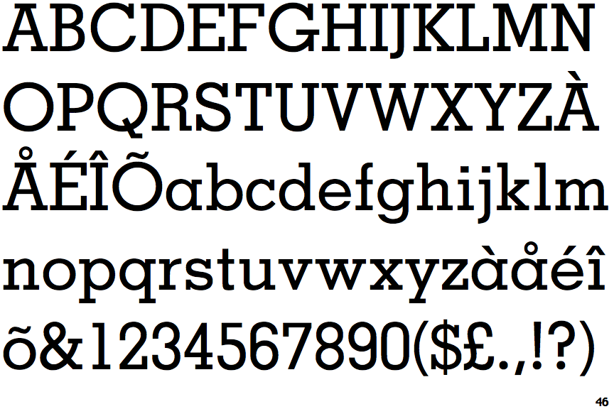
 |
The upper-case 'Q' tail crosses the circle.
|
 |
The '&' (ampersand) is traditional style with two enclosed loops.
|
 |
The upper-case 'J' descends below the baseline.
|
 |
The dot on the '?' (question-mark) is circular or oval.
|
 |
The lower-case 'a' stem stops at the top of the bowl (single storey).
|
 |
The centre bar of the upper-case 'E' has no serifs.
|
 |
The centre vertex of the upper-case 'W' has two separate serifs.
|
 |
The bar of the upper-case 'G' is double-sided.
|
 |
The centre bar of the upper-case 'F' has no serifs.
|
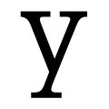 |
The tail of the lower-case 'y' has serifs on both sides.
|