Identifont

Fonts by Appearance

Fonts by Name

Fonts by Similarity

Fonts by Picture

Fonts by Designer/Publisher

Differences

TweetTweet Differences

Compare: and  

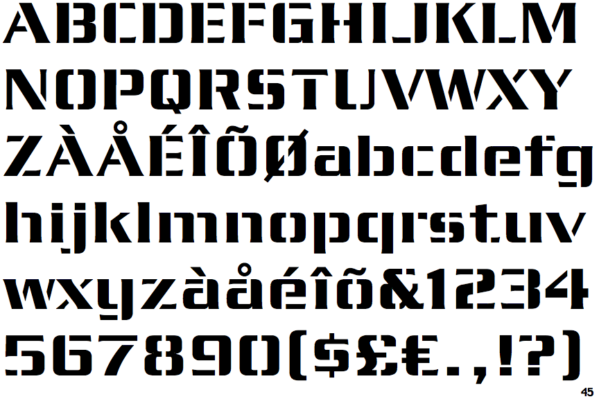
EF Serpentine Stencil

EF Serpentine Stencil

Open
The '&' (ampersand) is traditional style with a gap at the top.
Baseline
The centre vertex of the upper-case 'M' is on the baseline.
U-shaped
The sides of the lower-case 'y' are parallel (U-shaped).
Left Right
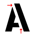
The gaps in the upper-case 'A' are top left and bottom right.

Note that the fonts in the icons shown above represent general examples, not necessarily the two fonts chosen for comparison.

Show Examples
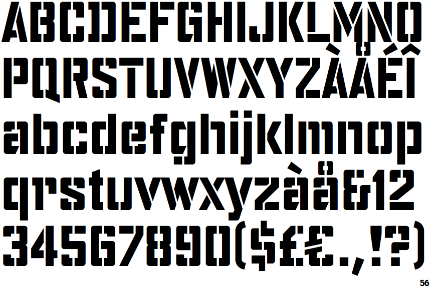
FF Water Tower

FF Water Tower

Gap top
The '&' (ampersand) looks like 'Et' with a gap at the top.
Above
The centre vertex of the upper-case 'M' is above the baseline.
V-shaped
The sides of the lower-case 'y' are angled (V-shaped).
Right Right
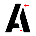
The gaps in the upper-case 'A' are top right and bottom right.