 |
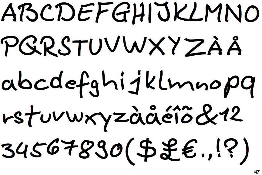
The upper-case 'Q' tail crosses the circle.
|
 |
The upper-case 'J' sits on the baseline.
|
 |
The centre bar of the upper-case 'P' meets the vertical.
|
 |
The upper-case 'U' has no stem/serif.
|
 |
The upper-case 'G' has double-sided bar.
|
 |
The 'l' (lower-case 'L') has a right-facing lower serif or tail.
|
 |
The upper-case 'E' is normal letter shape.
|
 |
The centre bar of the upper-case 'R' meets the vertical.
|
 |
The lower-case 'u' has no stem/serif.
|
 |
The '7' has a bar.
|
There are more than ten differences; only the first ten are shown.
Note that the fonts in the icons shown above represent general examples, not necessarily the two fonts chosen for comparison.
Show Examples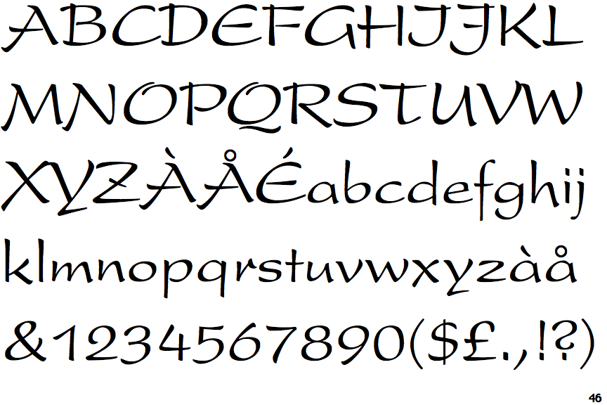
 |
The upper-case 'Q' tail is below and separated from the circle.
|
 |
The upper-case 'J' descends below the baseline.
|
 |
The centre bar of the upper-case 'P' leaves a gap with the vertical.
|
 |
The upper-case 'U' has a stem/serif.
|
 |
The upper-case 'G' has no bar.
|
 |
The 'l' (lower-case 'L') has no serifs or tail.
|
 |
The upper-case 'E' is drawn as a 'C' with a bar.
|
 |
The centre bar of the upper-case 'R' leaves a gap with the vertical.
|
 |
The lower-case 'u' has a stem/serif.
|
 |
The '7' has no bar.
|