Identifont

Fonts by Appearance

Fonts by Name

Fonts by Similarity

Fonts by Picture

Fonts by Designer/Publisher

Differences

TweetTweet Differences

Compare: and  

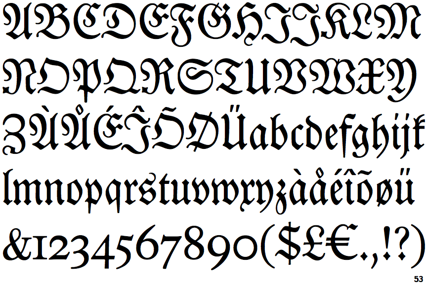
EF Neue Luthersche Fraktur

EF Neue Luthersche Fraktur

Touches
The upper-case 'Q' tail touches the circle.
Closed
The '4' is closed.
Round
The top storey of the '3' is a smooth curve.
None
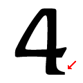
The foot of the '4' has no serifs.

Note that the fonts in the icons shown above represent general examples, not necessarily the two fonts chosen for comparison.

Show Examples
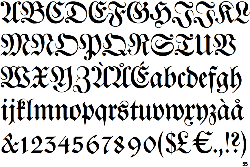
EF Justus Fraktur

EF Justus Fraktur

Crosses
The upper-case 'Q' tail crosses the circle.
Open
The '4' is open.
Angled
The top storey of the '3' is a sharp angle.
Right
The foot of the '4' has a single right-facing serif.