 |
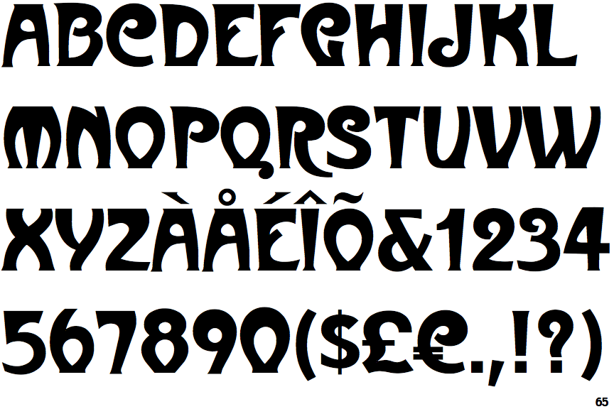
The '$' (dollar) has a single line crossing the 'S'.
|
 |
The '&' (ampersand) is traditional style with a gap at the top.
|
 |
The dot on the '?' (question-mark) is square or rectangular.
|
 |
The top storey of the '3' is a smooth curve.
|
 |
The leg of the upper-case 'R' is curved inwards.
|
 |
The centre bar of the upper-case 'R' leaves a gap with the vertical.
|
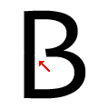 |
The centre bar of the upper-case 'B' leaves a gap with the vertical.
|
Note that the fonts in the icons shown above represent general examples, not necessarily the two fonts chosen for comparison.
Show Examples
 |
The '$' (dollar) has a single line which does not cross the 'S'.
|
 |
The '&' (ampersand) looks like 'Et' with a gap at the top.
|
 |
The dot on the '?' (question-mark) is diamond-shaped or triangular.
|
 |
The top storey of the '3' is a sharp angle.
|
 |
The leg of the upper-case 'R' is straight.
|
 |
The centre bar of the upper-case 'R' meets the vertical.
|
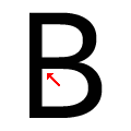 |
The centre bar of the upper-case 'B' meets the vertical.
|