Differences
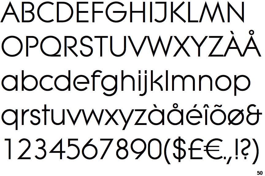
EF Litera
 |
The upper-case 'Q' tail touches the circle.
|
 |
The '$' (dollar) has a single line crossing the 'S'.
|
 |
The '&' (ampersand) looks like 'Et' with one enclosed loop (with or without exit stroke).
|
 |
The diagonal strokes of the upper-case 'K' meet at the vertical (with or without a gap).
|
 |
The verticals of the upper-case 'M' are sloping.
|
 |
The centre bar of the upper-case 'P' leaves a gap with the vertical.
|
 |
The upper-case 'J' has a bar to the left.
|
 |
The upper-case 'M' vertices are pointed at the top and bottom.
|
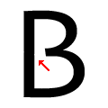 |
The centre bar of the upper-case 'B' leaves a gap with the vertical.
|
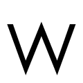 |
The upper-case 'W' vertices are pointed at the top and bottom.
|
There are more than ten differences; only the first ten are shown.
Note that the fonts in the icons shown above represent general examples, not necessarily the two fonts chosen for comparison.
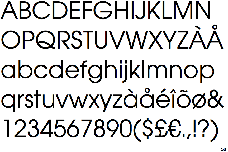
Show ExamplesITC Avant Garde (EF)
 |
The upper-case 'Q' tail crosses the circle.
|
 |
The '$' (dollar) has a single line which does not cross the 'S'.
|
 |
The '&' (ampersand) is traditional style with two enclosed loops.
|
 |
The diagonal strokes of the upper-case 'K' meet in a 'T'.
|
 |
The verticals of the upper-case 'M' are parallel.
|
 |
The centre bar of the upper-case 'P' meets the vertical.
|
 |
The upper-case 'J' has no bar.
|
 |
The upper-case 'M' vertices are flat at the top and bottom.
|
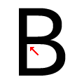 |
The centre bar of the upper-case 'B' meets the vertical.
|
 |
The upper-case 'W' vertices are flat at the top and bottom.
|
