 |
The verticals of the upper-case 'M' are sloping.
|
 |
The lower-case 'g' is double-storey (with or without gap).
|
 |
The upper-case 'U' has a stem/serif.
|
 |
The top of the upper-case 'A' has a serif or cusp on the left.
|
 |
The upper-case 'A' has tapered verticals.
|
 |
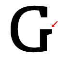
The bar of the upper-case 'G' is single-sided, left-facing.
|
 |
The lower-case 'e' has a straight horizontal bar.
|
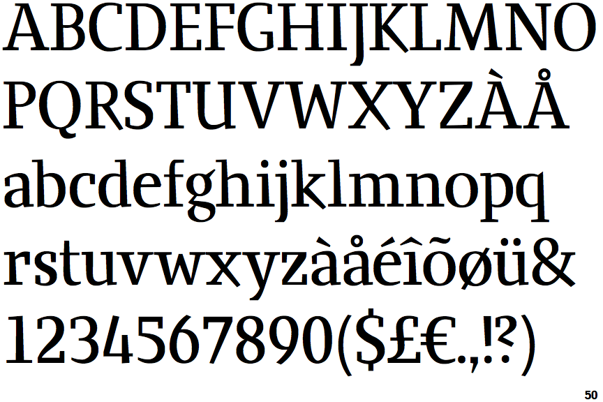
Note that the fonts in the icons shown above represent general examples, not necessarily the two fonts chosen for comparison.
Show Examples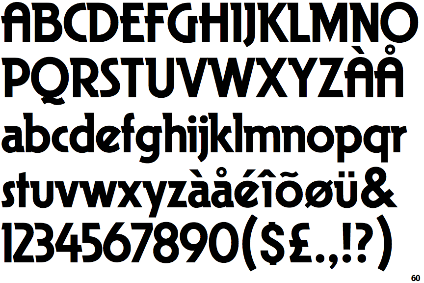
 |
The verticals of the upper-case 'M' are parallel.
|
 |
The lower-case 'g' is single-storey (with or without loop).
|
 |
The upper-case 'U' has no stem/serif.
|
 |
The top of the upper-case 'A' has no serifs or cusps.
|
 |
The upper-case 'A' has parallel verticals.
|
 |
The bar of the upper-case 'G' is single-sided, right-facing.
|
 |
The lower-case 'e' has a straight angled bar.
|