 |
The '4' is open.
|
 |
The top storey of the '3' is a sharp angle.
|
 |
The upper-case 'U' has no stem/serif.
|
 |
The upper-case 'G' has no spur/tail.
|
 |
The 'l' (lower-case 'L') has no serifs or tail.
|
 |
The upper-case 'J' has no bar.
|
 |
The upper-case letter 'I' is plain.
|
 |
The lower-case 't' has double-sided bar which forms a right-angle with the vertical.
|
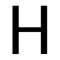 |
The bar of the upper-case 'H' is vertically central.
|
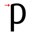 |
The top of the lower-case 'p' has no spur or serif.
|
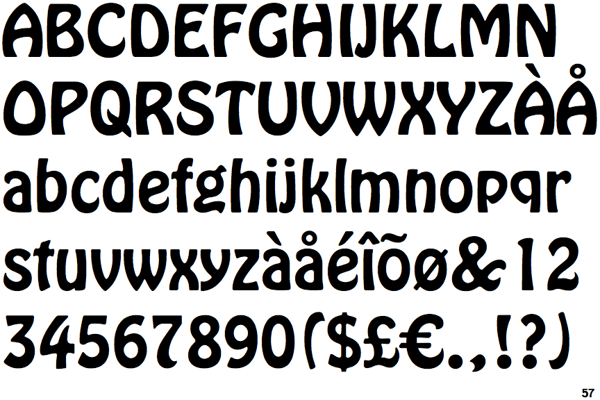
There are more than ten differences; only the first ten are shown.
Note that the fonts in the icons shown above represent general examples, not necessarily the two fonts chosen for comparison.
Show Examples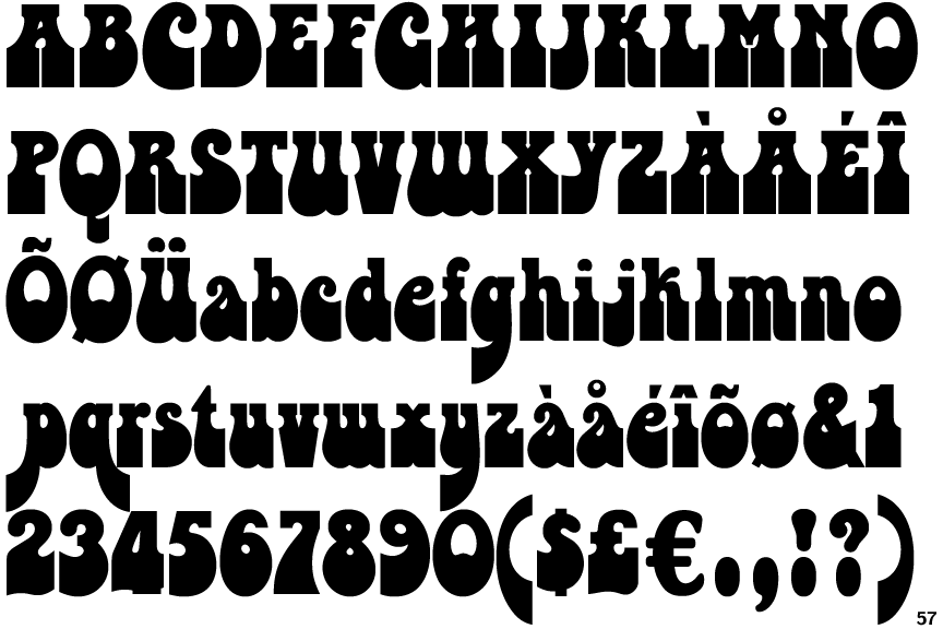
 |
The '4' is closed.
|
 |
The top storey of the '3' is a smooth curve.
|
 |
The upper-case 'U' has a stem/serif.
|
 |
The upper-case 'G' has a spur/tail.
|
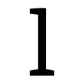 |
The 'l' (lower-case 'L') has a left-facing upper serif and double lower serifs.
|
 |
The upper-case 'J' has a bar both sides.
|
 |
The upper-case letter 'I' has serifs/bars.
|
 |
The lower-case 't' has double-sided bar which forms a diagonal with the vertical.
|
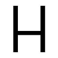 |
The bar of the upper-case 'H' is below centre.
|
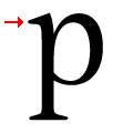 |
The top of the lower-case 'p' has a left-facing serif.
|