 |
The '4' is closed.
|
 |
The sides of the lower-case 'y' are angled (V-shaped).
|
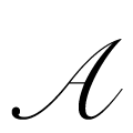 |
The upper-case 'A' bar is drawn as a separate stroke and no flourish on top.
|
 |
The centre strokes of the upper-case 'W' meet in a T on the left.
|
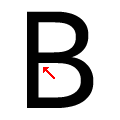 |
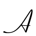
The centre bar of the upper-case 'B' meets the vertical.
|
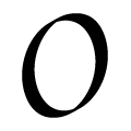 |
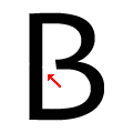
The upper-case letter 'O' has a smooth outline with no discontinuity or gap.
|
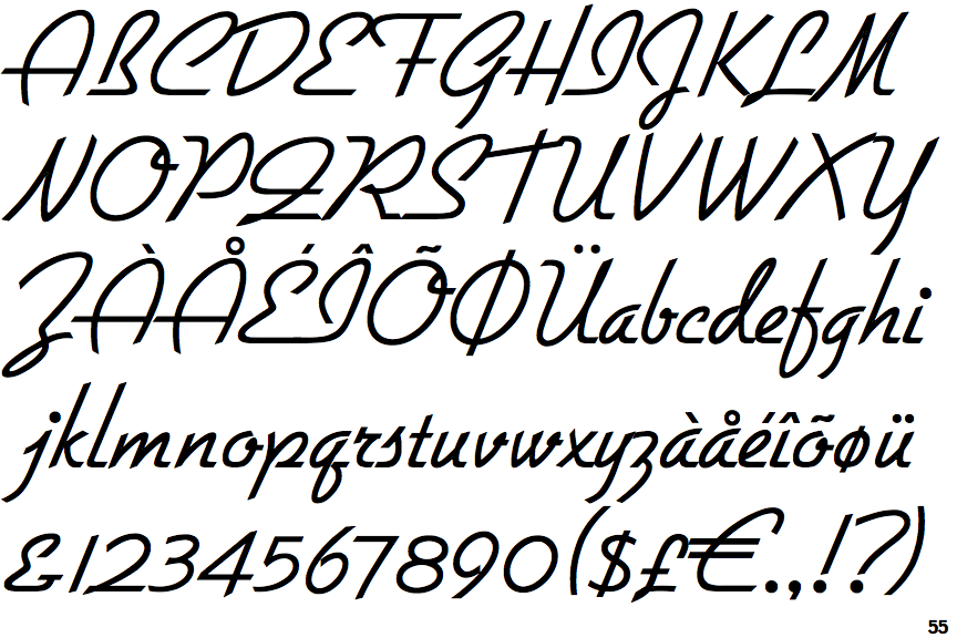
Note that the fonts in the icons shown above represent general examples, not necessarily the two fonts chosen for comparison.
Show Examples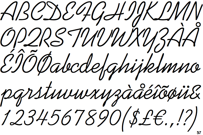
 |
The '4' is open.
|
 |
The sides of the lower-case 'y' are parallel (U-shaped).
|
 |
The upper-case 'A' right-hand vertical loops to form the bar.
|
 |
The centre strokes of the upper-case 'W' meet at a vertex.
|
 |
The centre bar of the upper-case 'B' leaves a gap with the vertical.
|
 |
The upper-case letter 'O' has a discontinuity or gap.
|