Identifont

Fonts by Appearance

Fonts by Name

Fonts by Similarity

Fonts by Picture

Fonts by Designer/Publisher

Differences

TweetTweet Differences

Compare: and  

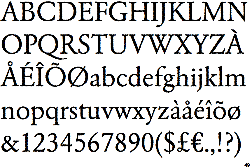
EF Garamond Rough H

EF Garamond Rough H

Closed
The '&' (ampersand) is traditional style with two enclosed loops.
Double
The diagonal strokes of the upper-case 'K' meet in a 'T'.
Gap
The centre bar of the upper-case 'P' leaves a gap with the vertical.

Note that the fonts in the icons shown above represent general examples, not necessarily the two fonts chosen for comparison.

Show Examples
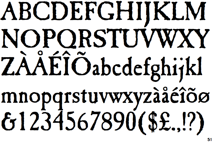
Caslon Antique

Caslon Antique

Gap top
The '&' (ampersand) looks like 'Et' with a gap at the top.
Single
The diagonal strokes of the upper-case 'K' meet at the vertical (with or without a gap).
Meets
The centre bar of the upper-case 'P' meets the vertical.