Identifont

Fonts by Appearance

Fonts by Name

Fonts by Similarity

Fonts by Picture

Fonts by Designer/Publisher

Differences

TweetTweet Differences

Compare: and  

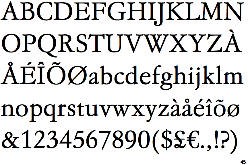
EF Garamond No. 5

EF Garamond No. 5

Below
The upper-case 'J' descends below the baseline.
Gap
The centre bar of the upper-case 'P' leaves a gap with the vertical.

Note that the fonts in the icons shown above represent general examples, not necessarily the two fonts chosen for comparison.

Show Examples
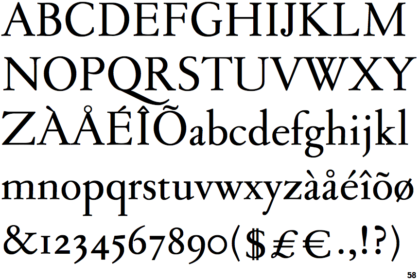
Sarabande

Sarabande

On
The upper-case 'J' sits on the baseline.
Meets
The centre bar of the upper-case 'P' meets the vertical.