 |
The '4' is closed.
|
 |
The centre vertex of the upper-case 'M' is on the baseline.
|
 |
The verticals of the upper-case 'M' are sloping.
|
 |
The centre bar of the upper-case 'P' leaves a gap with the vertical.
|
 |
The upper-case 'Y' arms and tail are separate strokes.
|
 |
The bar of the '4' crosses the vertical.
|
 |
The ends of the upper-case 'C' stroke are vertical or nearly vertical.
|
 |
The centre bar of the upper-case 'F' meets the vertical.
|
Note that the fonts in the icons shown above represent general examples, not necessarily the two fonts chosen for comparison.
Show Examples
 |
The '4' is open.
|
 |
The centre vertex of the upper-case 'M' is above the baseline.
|
|
The verticals of the upper-case 'M' are parallel.
|
 |
The centre bar of the upper-case 'P' meets the vertical.
|
 |
The upper-case 'Y' right-hand arm forms a continuous stroke with the tail.
|
 |
The bar of the '4' does not cross the vertical.
|
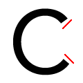 |
The ends of the upper-case 'C' stroke are angled.
|
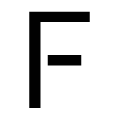 |
The centre bar of the upper-case 'F' leaves a gap with the vertical.
|