Differences
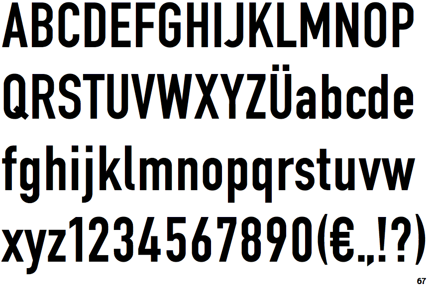
EF DIN 1451 Eng Neu
 |
The upper-case 'Q' tail crosses the circle.
|
 |
The '4' is open.
|
 |
The centre vertex of the upper-case 'M' is above the baseline.
|
 |
The lower-case 'g' is single-storey (with or without loop).
|
 |
The upper-case 'G' has no spur/tail.
|
 |
The 'l' (lower-case 'L') has a right-facing lower serif or tail.
|
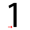 |
The '1' (digit one) has no base.
|
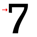 |
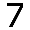
The top of the '7' has a downward-pointing serif or bar.
|
 |
The stem of the '7' is straight.
|
 |
The verticals of the upper-case letter 'O' have straight segments.
|
There are more than ten differences; only the first ten are shown.
Note that the fonts in the icons shown above represent general examples, not necessarily the two fonts chosen for comparison.
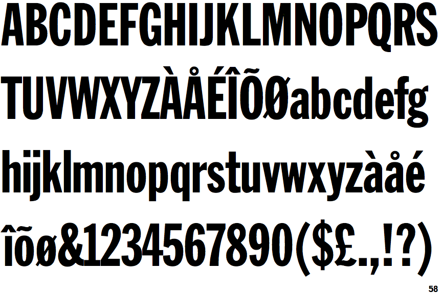
Show ExamplesFranklin Gothic Extra Condensed
 |
The upper-case 'Q' tail touches the circle.
|
 |
The '4' is closed.
|
 |
The centre vertex of the upper-case 'M' is on the baseline.
|
 |
The lower-case 'g' is double-storey (with or without gap).
|
 |
The upper-case 'G' has a spur/tail.
|
 |
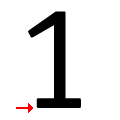
The 'l' (lower-case 'L') has no serifs or tail.
|
 |
The '1' (digit one) has double-sided base or serifs.
|
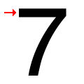 |
The top of the '7' has no serif or bar.
|
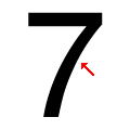 |
The stem of the '7' is curved inwards.
|
 |
The verticals of the upper-case letter 'O' are fully curved.
|
