 |
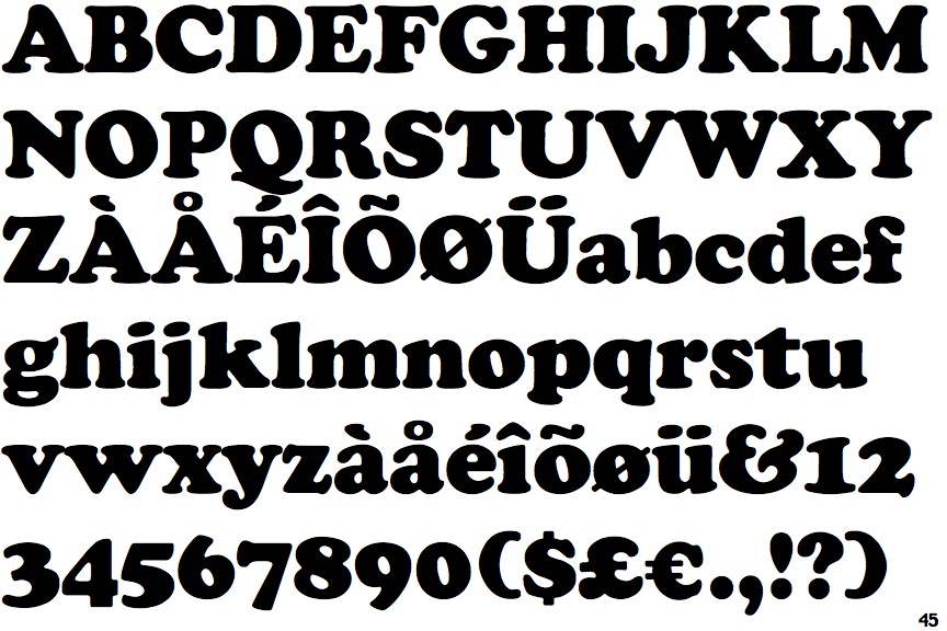
The upper-case 'Q' tail touches the circle.
|
 |
The '$' (dollar) has a single line which does not cross the 'S'.
|
 |
The '4' is closed.
|
 |
The centre bar of the upper-case 'P' meets the vertical.
|
 |
The top of the upper-case 'A' has a serif or cusp on the left.
|
 |
The foot of the '4' has no serifs.
|
 |
The lower-case 'e' has a straight horizontal bar.
|
 |
The lower storey of the lower-case 'g' has no gap.
|
 |
The stroke of the lower-case 'c' has a rounded end or ball.
|
 |
The top vertices of the upper-case 'M' have symmetrical single-sided serifs.
|
There are more than ten differences; only the first ten are shown.
Note that the fonts in the icons shown above represent general examples, not necessarily the two fonts chosen for comparison.
Show Examples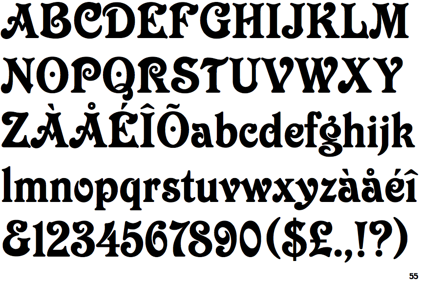
 |
The upper-case 'Q' tail crosses the circle.
|
 |
The '$' (dollar) has a single line crossing the 'S'.
|
 |
The '4' is open.
|
 |
The centre bar of the upper-case 'P' leaves a gap with the vertical.
|
 |
The top of the upper-case 'A' has serifs both sides, or a top bar.
|
 |
The foot of the '4' has double-sided serifs.
|
 |
The lower-case 'e' has a curved bar with no straight segment.
|
 |
The lower storey of the lower-case 'g' has a gap.
|
 |
The stroke of the lower-case 'c' has a flat end or downward-pointing serif.
|
 |
The top vertices of the upper-case 'M' have symmetrical double-sided serifs.
|