 |
The upper-case 'J' descends below the baseline.
|
 |
The lower-case 'a' stem curves over the top of the bowl (double storey).
|
 |
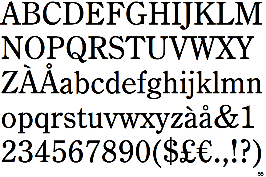
The strokes are upright.
|
 |
The feet of the lower-case 'h' have two serifs on each foot.
|
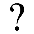 |
The '?' (question-mark) is hook-shaped.
|
 |
The diagonal strokes of the lower-case 'k' meet in a 'T'.
|
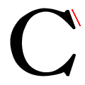 |
The top serif of the upper-case 'C' is angled left.
|
 |
The tail of the lower-case 'f' sits on the baseline.
|
Note that the fonts in the icons shown above represent general examples, not necessarily the two fonts chosen for comparison.
Show Examples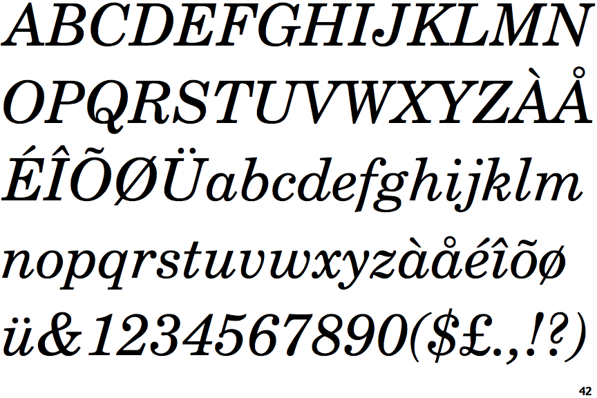
 |
The upper-case 'J' sits on the baseline.
|
 |
The lower-case 'a' stem stops at the top of the bowl (single storey).
|
 |
The strokes are sloped right (italic, oblique, or cursive).
|
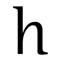 |
The feet of the lower-case 'h' have no serifs on the left and one on the right.
|
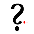 |
The '?' (question-mark) is like a backwards 'S'.
|
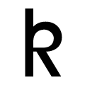 |
The diagonal strokes of the lower-case 'k' form a loop.
|
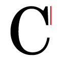 |
The top serif of the upper-case 'C' is vertical or nearly vertical.
|
 |
The tail of the lower-case 'f' descends below the baseline.
|