 |
The upper-case 'Q' tail touches the circle.
|
 |
The upper-case 'J' descends below the baseline.
|
 |
The centre vertex of the upper-case 'M' is above the baseline.
|
 |
The centre bar of the upper-case 'P' crosses the vertical.
|
 |
The upper-case 'G' has a bar to the left.
|
 |
The upper-case 'A' has parallel verticals.
|
 |
The upper-case 'E' is normal letter shape.
|
 |
The foot of the '4' has no serifs.
|
 |
The upper-case letter 'I' has serifs/bars.
|
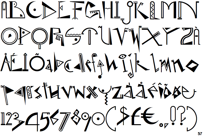
Note that the fonts in the icons shown above represent general examples, not necessarily the two fonts chosen for comparison.
Show Examples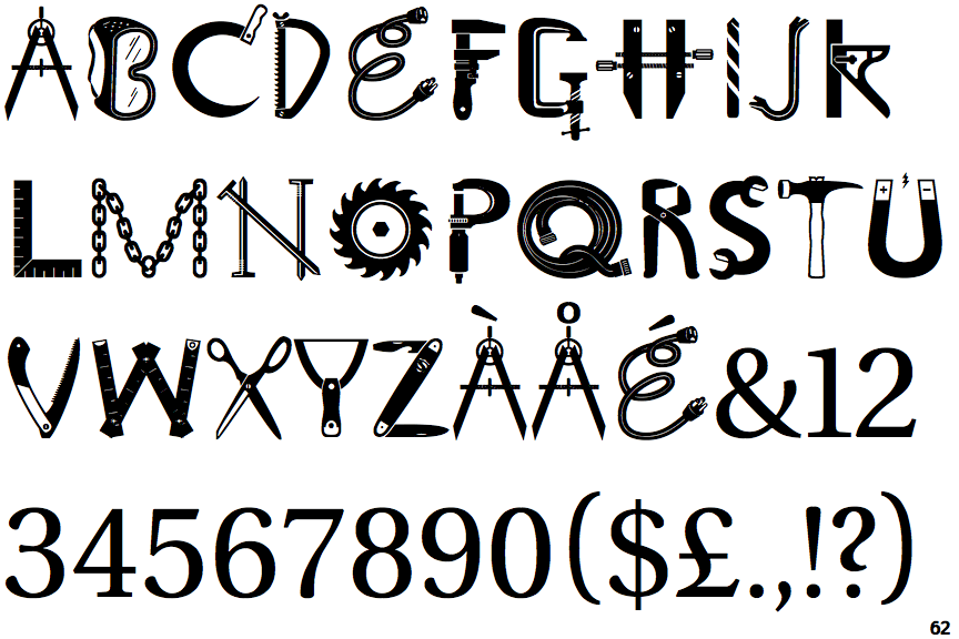
 |
The upper-case 'Q' tail crosses the circle.
|
 |
The upper-case 'J' sits on the baseline.
|
 |
The centre vertex of the upper-case 'M' is on the baseline.
|
 |
The centre bar of the upper-case 'P' meets the vertical.
|
 |
The upper-case 'G' has double-sided bar.
|
 |
The upper-case 'A' has tapered verticals.
|
 |
The upper-case 'E' is drawn as a single stroke (with or without loop).
|
 |
The foot of the '4' has double-sided serifs.
|
 |
The upper-case letter 'I' is plain.
|