Identifont

Fonts by Appearance

Fonts by Name

Fonts by Similarity

Fonts by Picture

Fonts by Designer/Publisher

Differences

TweetTweet Differences

Compare: and  

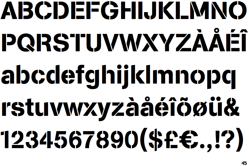
EF Arston Stencil

EF Arston Stencil

Above
The centre vertex of the upper-case 'M' is above the baseline.
Parallel
The verticals of the upper-case 'M' are parallel.
2-Storey
The lower-case 'a' stem curves over the top of the bowl (double storey).
Outwards
The leg of the upper-case 'R' is curved outwards.
Stem
The lower-case 'u' has a stem/serif.

Note that the fonts in the icons shown above represent general examples, not necessarily the two fonts chosen for comparison.

Show Examples
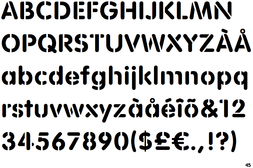
EF Rounded Stencil

EF Rounded Stencil

Baseline
The centre vertex of the upper-case 'M' is on the baseline.
Sloping
The verticals of the upper-case 'M' are sloping.
1-Storey
The lower-case 'a' stem stops at the top of the bowl (single storey).
Straight
The leg of the upper-case 'R' is straight.
No-Stem
The lower-case 'u' has no stem/serif.