 |
The centre vertex of the upper-case 'M' is on the baseline.
|
|
The verticals of the upper-case 'M' are parallel.
|
 |
The top storey of the '3' is a smooth curve.
|
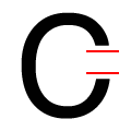 |
The ends of the upper-case 'C' stroke are horizontal or nearly horizontal.
|
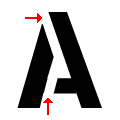 |
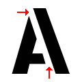
The gaps in the upper-case 'A' are top left and bottom left.
|
Note that the fonts in the icons shown above represent general examples, not necessarily the two fonts chosen for comparison.
Show Examples
 |
The centre vertex of the upper-case 'M' is above the baseline.
|
 |
The verticals of the upper-case 'M' are sloping.
|
 |
The top storey of the '3' is a sharp angle.
|
 |
The ends of the upper-case 'C' stroke are vertical or nearly vertical.
|
 |
The gaps in the upper-case 'A' are top left and bottom right.
|