 |
The upper-case 'Q' tail forms part of the stroke of an open circle.
|
 |
The '4' is open.
|
 |
The centre bar of the upper-case 'P' leaves a gap with the vertical.
|
 |
The upper-case 'U' has a stem/serif.
|
 |
The upper-case 'Y' right-hand arm forms a continuous stroke with the tail.
|
 |
The upper-case 'E' is drawn as a single stroke (with or without loop).
|
 |
The centre bar of the upper-case 'R' leaves a gap with the vertical.
|
 |
The upper-case 'I' is a stroke with a flourish on top - not closed.
|
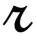 |
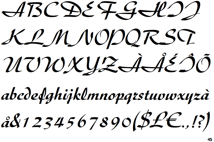
The lower-case 'r' is italic script shape.
|
 |
The stroke of the 'l' (lower-case 'L') has a loop.
|
Note that the fonts in the icons shown above represent general examples, not necessarily the two fonts chosen for comparison.
Show Examples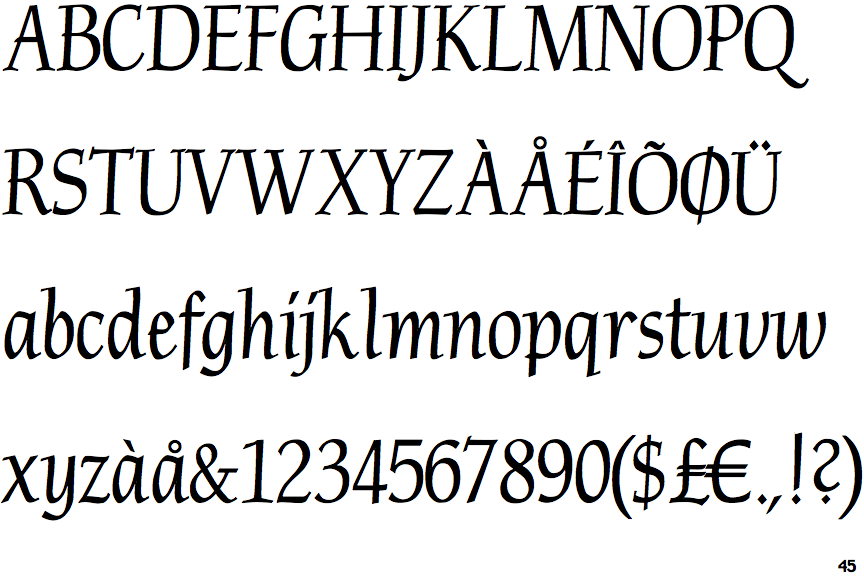
 |
The upper-case 'Q' tail touches the circle.
|
 |
The '4' is closed.
|
 |
The centre bar of the upper-case 'P' crosses the vertical.
|
 |
The upper-case 'U' has no stem/serif.
|
 |
The upper-case 'Y' arms and tail are separate strokes.
|
 |
The upper-case 'E' is normal letter shape.
|
 |
The centre bar of the upper-case 'R' crosses the vertical.
|
 |
The upper-case 'I' is a single stroke with serifs.
|
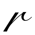 |
The lower-case 'r' is normal letter shape.
|
 |
The stroke of the 'l' (lower-case 'L') has no loop.
|