 |
The upper-case 'Q' tail touches the circle.
|
 |
The characters have serifs.
|
 |
The '4' is open.
|
 |
The diagonal strokes of the upper-case 'K' meet at the vertical (with or without a gap).
|
 |
The lower-case 'g' is double-storey (with or without gap).
|
 |
The top of the lower-case 'q' has a right-facing serif.
|
 |
The '1' (digit one) has double-sided base or serifs.
|
 |
The stem of the '7' is curved outwards.
|
 |
The '8' is asymmetrical about a vertical axis.
|
 |
The lower-case 'b' has a left-facing lower serif.
|
There are more than ten differences; only the first ten are shown.
Note that the fonts in the icons shown above represent general examples, not necessarily the two fonts chosen for comparison.
Show Examples
 |
The upper-case 'Q' tail crosses the circle.
|
 |
The characters do not have serifs.
|
 |
The '4' is closed.
|
 |
The diagonal strokes of the upper-case 'K' meet in a 'T'.
|
 |
The lower-case 'g' is single-storey (with or without loop).
|
 |
The top of the lower-case 'q' has a vertical or slightly angled spur (pointed or flat).
|
 |
The '1' (digit one) has no base.
|
 |
The stem of the '7' is curved inwards.
|
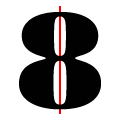 |
The '8' is symmetrical about a vertical axis.
|
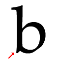 |
The lower-case 'b' has a downward-pointing spur or foot (pointed or flat).
|