 |
The upper-case 'Q' tail touches the circle.
|
 |
The upper-case 'J' sits on the baseline.
|
 |
The upper-case 'U' has a stem/serif.
|
 |
The top stroke of the upper-case 'C' has no upward-pointing serif.
|
 |
The centre bar of the upper-case 'R' meets the vertical.
|
 |
The top of the upper-case 'W' has four upper terminals.
|
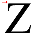 |
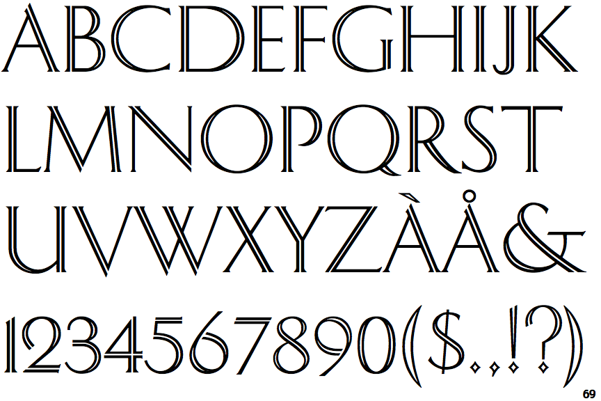
The top stroke of the upper-case 'Z' has no upward-pointing serif.
|
Note that the fonts in the icons shown above represent general examples, not necessarily the two fonts chosen for comparison.
Show Examples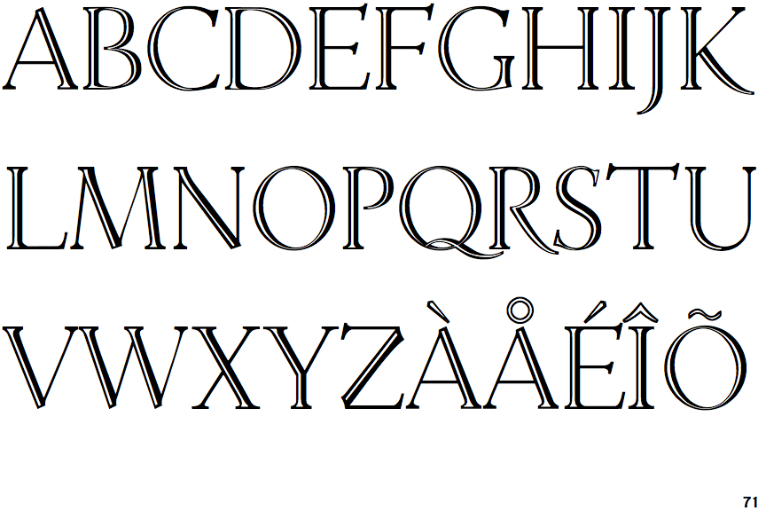
 |
The upper-case 'Q' tail crosses the circle.
|
 |
The upper-case 'J' descends below the baseline.
|
 |
The upper-case 'U' has no stem/serif.
|
 |
The top stroke of the upper-case 'C' has a vertical or angled upward-pointing serif.
|
 |
The centre bar of the upper-case 'R' leaves a gap with the vertical.
|
 |
The top of the upper-case 'W' has three upper terminals.
|
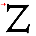 |
The top stroke of the upper-case 'Z' has a vertical or angled upward-pointing serif.
|