 |
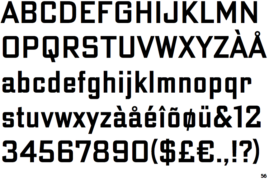
The upper-case 'Q' tail crosses the circle.
|
 |
The '$' (dollar) has a single line crossing the 'S'.
|
 |
The '4' is closed.
|
 |
The upper-case 'A' has tapered verticals.
|
 |
The sides of the lower-case 'y' are angled (V-shaped).
|
 |
The dot on the lower-case 'i' or 'j' is square or rectangular.
|
 |
The tail of the lower-case 'y' is substantially straight.
|
 |
The upper-case letter 'I' is plain.
|
Note that the fonts in the icons shown above represent general examples, not necessarily the two fonts chosen for comparison.
Show Examples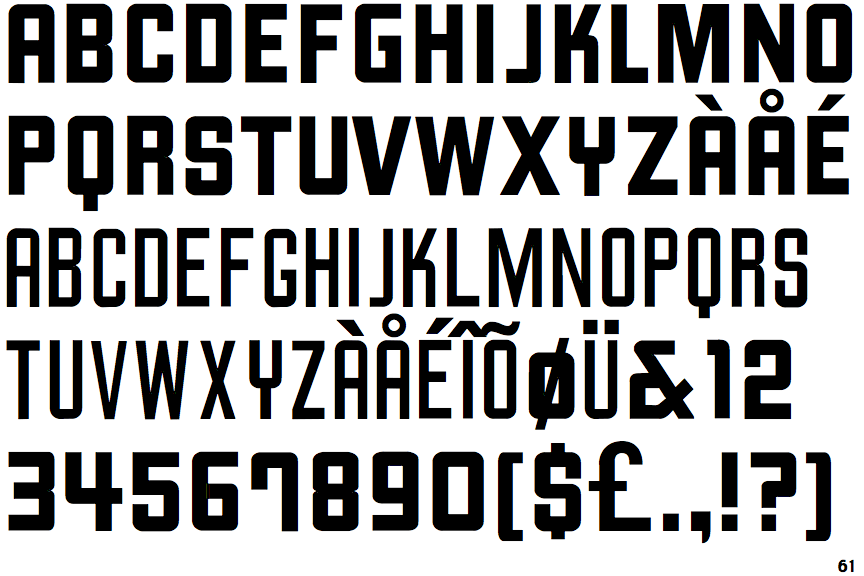
 |
The upper-case 'Q' tail touches the circle.
|
 |
The '$' (dollar) has a single line which does not cross the 'S'.
|
 |
The '4' is open.
|
 |
The upper-case 'A' has parallel verticals.
|
 |
The sides of the lower-case 'y' are parallel (U-shaped).
|
 |
The dot on the lower-case 'i' or 'j' is circular or oval.
|
 |
The tail of the lower-case 'y' is curved or U-shaped to the left.
|
 |
The upper-case letter 'I' has serifs/bars.
|