 |
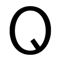
The upper-case 'Q' tail extends into or lies inside the circle.
|
 |
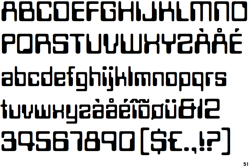
The '$' (dollar) has a single line which does not cross the 'S'.
|
 |
The '&' (ampersand) looks like 'Et' with one enclosed loop (with or without exit stroke).
|
 |
The diagonal strokes of the upper-case 'K' connect to the vertical via a horizontal bar.
|
 |
The verticals of the upper-case 'M' are parallel.
|
 |
The upper-case 'G' has no spur/tail.
|
 |
The 'l' (lower-case 'L') has no serifs or tail.
|
 |
The top of the lower-case 'q' has no spur or serif.
|
 |
The lower-case 'e' has a straight horizontal bar.
|
 |
The lower-case 'u' has no stem/serif.
|
There are more than ten differences; only the first ten are shown.
Note that the fonts in the icons shown above represent general examples, not necessarily the two fonts chosen for comparison.
Show Examples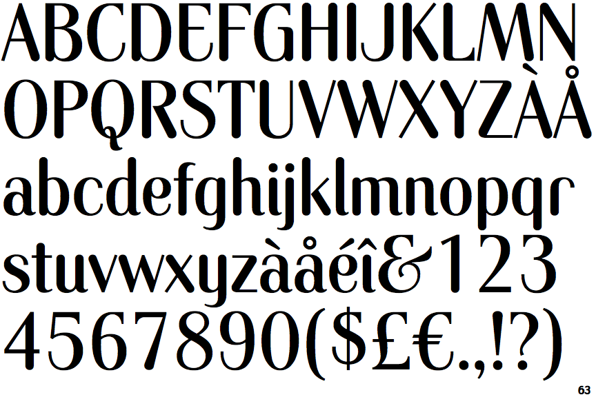
 |
The upper-case 'Q' tail crosses the circle.
|
 |
The '$' (dollar) has a single line crossing the 'S'.
|
 |
The '&' (ampersand) looks like 'Et' with a gap at the top.
|
 |
The diagonal strokes of the upper-case 'K' meet at the vertical (with or without a gap).
|
 |
The verticals of the upper-case 'M' are sloping.
|
 |
The upper-case 'G' has a spur/tail.
|
 |
The 'l' (lower-case 'L') has a right-facing lower serif or tail.
|
 |
The top of the lower-case 'q' has a vertical or slightly angled spur (pointed or flat).
|
 |
The lower-case 'e' has a curved bar with no straight segment.
|
 |
The lower-case 'u' has a stem/serif.
|